STATEMENT OF INTENT
In this project I aim to produce content for this page, based entirely of my ideas on the theme, which is Light & Dark and create a various range of outcomes that I will piece together to devise my final portfolio. I further aim to portray my creativity through my unique interpretations , as I am truly fascinated by the way lighting works, how the light will only seem bright if darkness is present and how shadows also compliment this the theme greatly. I intend to delve into the approach of shadows and to explore the use of shadows and patterns through the concept of Light & Dark. I would like to convey this idea on a model to show the duality of the different tones but if possible on Urban landscapes to show the idea of modernism.
For my initial research I will start by researching professional photographers who are known for their expertise in Light & Dark related concepts, one photographer that has influenced my ideas is George Mayers. He is infamous for his geometrical approach on the Light & Dark theme where he carefully balances both elements of light and darkness, to display a contrast through the use of shapes and shadows. Although this is the key idea that I would like to proceed with, I am also open to the idea of conveying the theme through Urban landscapes, which also expresses the idea of modernism. A photographer whose work has also conveyed the Light & Dark theme through this style is Wil Haub, he is known to take subjective photographs in monochrome. I believe that this would be a unique approach to the theme but would be difficult to achieve as it requires travelling and from previous experience from my first project I know that time is limited and I need to make use of my available resources, as I have learned that what I intend to do achieve does not always take effect.
When choosing the theme I had two options to choose from; Framing or Light & Dark. I decided to pick Light & Dark as I felt that I could go further with this theme rather than framing, I also believe that framing is basic and I would not be able to mold it into something creative and unique. Light & Dark consists of vast concepts that can portray a numerous amount of meaning and symbolism and that is what I hope to portray through my photographs. I wish to portray allure and a sense of mystery through a variety of innovative visuals. My initial thoughts were to just use simplistic yet effective colours, like just black and white which are the epitome of light and dark, however I began to realise opposing colours can also have the same effect and make the photograph more stimulating and bold, which is what I want.
To show progression through my work I will show how I have developed my creativity through the process. My initial thoughts were to just use simplistic yet effective colours, like just black and white which are the epitome of light and dark, however I began to realise opposing colours can also have the same effect and make the photograph more stimulating and bold, which is what I want. I will show progress by showing that I have went on a journey with my work and that I have merged my ideas with traditional aspects of the theme to do so.
I have many ideas in mind in terms of experimentation and techniques. A typical technique to achieve what I want requires the use of a lamp covered by a filter with lines cut through the filter to achieve patterns and linings on the model or subject, or to further create enlarged shadows by controlling how much or little light passes through, this would be in a studio shot of a dark setting. However I have conceptualised an idea of my own, where I will use a a projector of some sort that project patterns that I will find on the internet or a website to reflect onto my model, rather than just using traditional technique to do so. I will do both to see which method is more effective and to see if my concept will work.
As my work progresses, I will make sure to show my journey through this project by adding full galleries of every photograph I make and do a set up to show my understanding of my objectives. I will also do my best and worst on each set of photographs to further demonstrate my ability to assess my own work rationally, which will help me improve my next set of photographs. I will also show progress through the use of Photoshop if needed on a photograph to present my drive to ensure high quality outcomes and this will further help refine my Photoshop skills generally. When I am satisfied wiith my galleries, best and worst and outcomes I will write a final evaluation to conclude my thoughts and judgement on the project, what went well, what didn't and if given the time what I would do differently.
For this project I have chosen the theme of 'Light & Dark' because it allowed me to explore different lighting techniques and studio setups. Some ideas that came to mind for this project are; a studio set up with a black background, the model preferably a female with their hair slicked back with a ray of light only on one side of the face, enhancing the depths of the eyes. Or something as simplistic as a vibrant coloured rose on a black/white background to bring attention straight to the rose. I would like to use black & white, but also colours when needed, to attract the audience and change up the style. Although black & white is the ideal match, it gets boring after seeing it repetitively, also light & dark does not mean that you only have to stick with those colours, this theme can be shown throughout many contrasting colours. I would like to further enhance my perspective with this project as it allows me to think out of the box and create simplistic yet effective photographs.
MOODBOARD


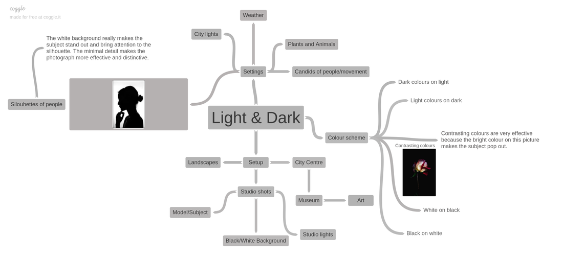
COGGLE MINDMAP
ARTIST RESEARCH
George Mayers

Content & Composition
The focus point of this black and white image is clearly the model's face which I am instantly drawn to, specifically her left eye which has been illuminated by a lamp and what seems like a gobo that has been placed in front of the lamp, to control the movement of the light for this precise outcome. This photograph has been taken at eye level, where the model is stood directly in front of the camera to further emphasise that she is the main focal point, the lack of other components in this photograph also emphasises the fact that she's the main attraction. The darker lighting in the rest of the image makes the rest of the model's body and face quite obscure, this also helps dramaticise the one segment of her face that is illuminated and also emphasise the harshness of the little light there is which helps create a clear distinction between the lighter and darker segments. The darker lighting greatly contrasts the harsher lighting on the model's face, this help creates a dual mood and tone to the image, thus emphasising the theme of light and dark. As there is not much light present, one can assume that perhaps a high shutter speed has been used to capture the little light there is, to help brighten the image rather than illuminating it entirely. Rule of thirds has most definitely been used as the illuminated segment is specifically on what is known as 'sweet spot' which pinpoint the model's eye directly in the centre of it. The model's firm stance creates a balance to the image as the shoulder are at equal height giving a rounded, sophisticated look to the photograph. As this is clearly a studio set up, a tripod has also definitely been used to ensure a sturdy positioning of the camera which help create a very elegant and professional finishing. The use of tripod must have also been useful as it creates a balance, as the movement of the lighting that has highlighted the model's eyes must have been needed to be controlled for the accurate outcome needed, if a tripod had not been used it would have come out blurry and not as the photographer intended. I believe that a deep depth of field has also been used to ensure the sharpness of this image, as every detail is evident on the model's face, perhhaps that could also be due to the highlighted segment. As the background is not as clear and crisp as the model one can assume that a high aperture has been used to create this blurry look.
Context
George was born in Nizhny Tagil, Russia in 1985. In 2004 he graduated from the Ural College of Arts and Crafts with honors where he majored in environmental design.Up to 2007 he worked as an interior designer. He participated and became a prize winner of Russian national contests of architecture and design. His works were published in professional books and periodicals for architects and designers by such publishing houses as Tatlin and Univer Press. Since 2008 he has been taking part in well-known international photo contests such as Photography Masters Cup (USA), The Spider Awards (USA), National Portrait Gallery Awards (UK), Maestro Photo Contest (Russia). In 2011 George Mayer won the Russian photo contest Young Photographers of Russia. The contest projects were exhibited in Kazan, Moscow, at the international art festival in Marsciano (Italy) and were published in professional editions. In 2011 George was the winner of the photo contest The Spider Awards (USA) where he won Photographer of the Year, Outstanding Achievements in Black-and-White Photography. {http://georgemayerstudio.com/about}. This photograph was taken from his 'Shadow' project which won first place in a professional competition.
Connection
The theme of this photograph is obviously light and dark, which is exactly what my project is, this helps me get an insight into the real world of photographty and allows me to learn the concepts within this theme. Coming across the photographer, George Mayers who is known for his exquisite photographers that dabble with the concept and light and shadows was a real eye opener for me, as he has helped shape my vision for what I foresee my project to become. The image links directly to my work as I am very fond of portrait photography and wanted to incorporate portrait photography with the given theme of light and dark, at first I was confused and wanted to do generic ideas but this photograph has given me much inspiration on how I will approach the theme. I aim to use patterns, not only black and white but contrasting colours for example magenta and blues, reds and greens and illuminate my model's face with a projection somehow, possibly using gels and gobos and lamp. I like that the image is black and white as it expresses the theme of 'light and dark' evidently and it gives the photograph a very refined and sophisticated look and I want to try to create a similar look to my photographs.
Comment
I love how sleek and refined this image is, it's not bombarded with harsh colours or extra components and props in the image, I love how simplicity of the image, yet it still has an allure to and I aim to try to incorporate this into my future work. There are no weaknesses to this images in my eyes, I am completely in love with everything about this, from the sharp precision of the light, to the mellow tone from the darkness of the image, combined together it is truly a magnificent piece of art. This image inspires me in many ways, opening my eyes to a completely new approach to this complex theme, how the task has been executed and the overall outcome, I aim to do something similar where I will also project precise rays of light and perhaps even contrasting colours onto my models face. I certainly believe there's a deeper meaning to the image, there is a famous saying that 'the eyes are a window to the soul' which I believe perfectly matches this image. Much of our emotions are reflected from ours, so even you aren't speaking or even making any movements our eyes explain what we are feeling, hence why the rest of the model's face and body has been blackened out.
Wil Haub
Content & Composition
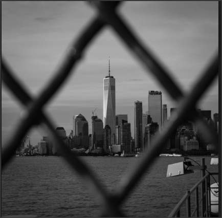
In the image there is a fence framing the urban city of New York, there is one very tall skyscraper which is distinctive from the rest because it is white, it is known as the world trade centre, the rest of the buildings are gray, there is also a body of water. This photograph looks quite recent due to the modern buildings in the background, along with the a black & white theme. Even though there are many buildings etc, there is no sight of people, creating a distopian atmosphere. This image has been taken at a front view, this is effective because you are able to view all the contrasts of the picture. There are many focal contrasts in this image, for example the black fence against the light gray sky, the diamond shaped hole in the fence perfectly frames the conspicuous skyscraper, this is effective because this bring your attention straight to the distinctive building as it stands out from the rest. Subjectively, the skyscraper stands out to me the most because it is white and most in focus compared to the rest. This building specifically being white it means that it has value and meaning to society, hence why it is white and the rest are shades of gray. The lighting is quite soft because there are no harsh or sharp lines, I think that the image was originally taken in colour and presumably photo shopped into this black, gray and white theme. Clearly a tripod has been used, considering the fence framing the skyscraper precisely in the middle. If a tripod had not been used, the whole image would have likely been out of focus and most definitely the building would not have been centrally located. This would result in less attraction to the image, therefore losing the beauty of it.
Context
The photographer of this photograph is Wil Haub, he said he is always 'striving to get a different picture of the sights - something a little bit unexpected.' I am assuming that he means to say he likes to capture pictures with different perspectives and interesting angles, 'some detail I find interesting.' This image looks relatively recent as the world trade centre used to have two buildings known as the twin towers, the twin towers were destroyed in 2001, and was re-built in November 3 2014 into just one tower, known as the One world trade center.
Connection
The theme of this photograph is light and dark, with framing. This links to my theme as I am doing light and dark inspired photography. It uses a different perspective which I also aspire to incorporate, the content is very unique as the main subject of the image is of value to society.
Comment
I think the meaning behind this picture is to show that we are trapped within this materialistic world and obsessed with worldly things that have no emotional value. That in these days we are prisoners in this world, no matter how much the law tells us we are free, we are trapped within a system we cannot escape. I am quite fond of this image because as much as it pleasing to the eye, it also has a metaphorical meaning, which adds depth and significance to image.
Raquel Carmona
Content & Composition
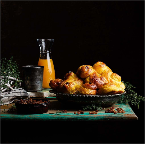
In this image there is a table with pasties to the right, raisins at the front left, orange juice in the jug at the back left and herbs around the different objects, on a black background. The orange juice and pastries stand out the most as they are vibrant bright colours, which is why it stands out against the black, as it makes you focus on the light colours. There is a spot of light on the right of the pastries, making the lighting stronger and magnifying the depths of the layers on the pastries. Rule of thirds has been also used, as the orange juice, herbs and raisins only take up one third of the image, however as the pastries have a larger surface area they take up two thirds of the image. The composition is also very strong as all the objects are in a specific place, and there is a sweet spot on the top right of the orange juice, as it is highlighted. The tables edges have been used as leading lines, as they go further back creating a 3D effect adding depth. The table has also been painted coarsely in a turquoise, teal colour which makes it very distinctive against the black background. Gathering all the settings that have been used, this evidently is a studio shot, I am also certain that a tripod has been used as their is very minutely detailed objects that would need a slow shutter speed in order to capture every detail.
Context
This photograph was taken by Raquel Carmona, who is a food blogger. She is of Brazilian descent and grew up there, but was born in Cordoba, Spain. She was born 25th of May 1972, which makes Gemini her astrological sign. Raquel is 46 years of age and is married with children. Carmona is also an author and has a book called 'Food: El festine de la fotografia y el Estilismo Gastronomica' which translates to, Foodie: The feast of Photography and Gastronomic Styling, which was published in 2018.
Connection
The theme is image is still life, contrasting colours/light & dark and studio shots. It is relevant to my theme as I am also doing the light & dark theme and I wish to explore using contrasting, vibrant colours rather than just black & white. I am also further enhancing my studio set up and shots skills and examining and studying this picture will help me to do so. This image seems to reflect 17th & 18th century traditional Dutch banquets, as pastries were stereo typically a famous cuisine for the Dutch.
Comment
I really like the vibrancy and simplicity of this image, I aspire to be as creative yet crude. The composition overall is the strongest and most effective as all the objects are arranged and positioned differently but as a whole look perfect. Personally, I do not like some of the objects used in this picture, but the objects used are still compelling.
Content & Composition
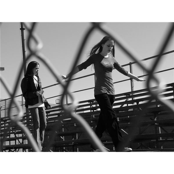
In this photograph there are two teenage females walking on the bleachers, their movement has been framed by the diamond shaped fence. This photograph seems somewhat new, I know this because of the way the girls are dressed and there is an electricity pole behind the bleachers. This image has a black & white/greyscale theme. I think this image is somewhere in America because of the way that this sports area is set, normally in the UK sports pitches are not set up this way. This image is quite effective in my opinion, maybe portraying loneliness, even though someone is there with you. There isn't much in the background just a bright sky, I know it is bright because if it was dark it would have been a darker colour, perhaps grey or a shade of black, however here it is a very light grey, implying it is daylight. The focal point in this photograph are the two girls, but mainly the girl with her arms out, as she is slightly more in focus than the other girl.
Connection
This photograph links to my theme and project as I am also doing light and dark, and this image perfectly portrays my theme, as this image is in black & white/greyscale. It also links to my work specifically as I want to focus on human focal points and candids within my work and experimenting with the use of light & dark colours. This image has been taken in black & white to create a moody and depressing atmosphere, the colours black & white often mean the opposite of a happy and lively atmosphere, therefore establishing a melancholic and bleak atmoshpere.
Comment
I like this image very much as it has been framed and taken from a very unique perspective therefore making the image different from others. This image also has a very strong composition therefore making it bold and stand out. I also like the fact that they have used youth to represent sadness and anxiety within this image, adding a meaning and deepening the essence of this image. This image was also helpful to me as it is in black & white, the theme which I am currently doing. I do not like the fact that the images setting was quite boring and dull, the two females could be standing on rocks or a bridge, something for exciting and interesting.
Setup 1
Dominoes


Here is my first set up for my theme of 'Light & Dark' , for the first set of images, we decided to go with the natural white light of the lamp to see just how illuminating the images could be with the right amount of shadow without it being too bleached out. This was mainly done so we could start experimenting with the lighting and shadows to understand how the it all affected the image and how we could adjust ourselves and the camera settings to get it perfect. We did this so when we starting the 'gels' in the second shoot we could understand the concept of the lighting and shadows and could just focus on the quality of the images. In the second shoot where we used a 'gel', it created this red tone to the dominoes which I found quite interesting as the image has a moody yet vibrant tone to it. We tried to manipulate the lighting by having the gel on the light source which was the lamp at multiple angles to create the shadows that are so evident in the background which I find that it is one of the main strengths of the image. Here I went as close as possible but at a distance where it was not too blurry, I adjusted the lense multiple times to get clear, sharp focus on every detail of the dominoes. To get this look I also increased the depth of field and lowered the shutter speed, to make sure no detail was missed, the ISO was also quite low as I wanted to create gloomy look the images. I really like the shadows created by the use of lighting and angles and I definitely want to continue this but I believe that it would much more effective on a face rather than an object. I have decided that I will further develop this project with the use of a model and then experiment with lighting and patterns, this would also help me learn how to create a professional looking image and how to maintain the beauty of the shadowing on a person. Doing this small shoot is very useful as it gives me a clear insight on what I want to do further on in this project and how I can use this idea but more practically on human.


Photoshop oucomes for dominoes
use ducklinks
use ducklinks
Shoot One


Best Images |
Worst Images |
|
These are my best as they are all composed to a high standard therefore, creating a professional impression. As my model is the main focal point of this image, her positioning corresponds to the pattern behind perfectly.
|
These are the worst because my goal was to have one side of the face lit, on a side profile but the first one is random as it is aimlessly lit. In the second photo she was not ready for the picture so it has come out unprofessional as her eyes are fluttering. Additionally, the way I composed the images were wrong, as the angle meant that the tool bar on word was visible, cheapening the photograph.
|


Shoot Two


|
|
|
These are my best as they have come out very professional and are well composed. In the first set of images, they are crystal clear, which helps define my model side profile. In the second set the leading lines divides her face into three, which attracts the viewers eyes directly into the models face. In the third set I have composed the image to apply rule of thirds which gives the image a balanced composition.
|
These are my worst because they are all at an unattractive angle therefore making them unappealing. Additionally the model clearly was not ready for the photo to be taken and it resulted in an unprofessional impression.
|


Shoot Three


Shoot Four


Shoot Five


Photoshop
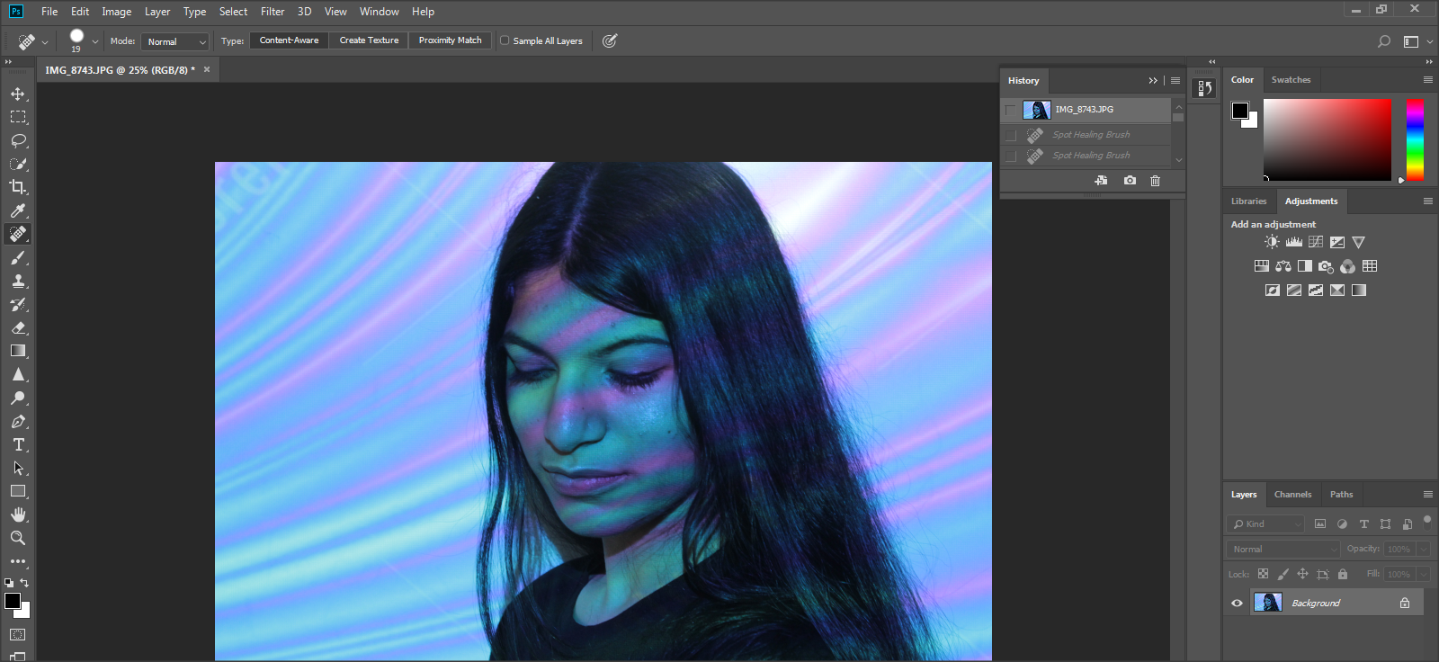
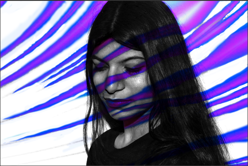
The Original Image

|
Here I used to 'spot healing brush' tool to soften and smoothen her skin, where any lines, blemishes and spots may be to give an overall clear complexion.
|

|
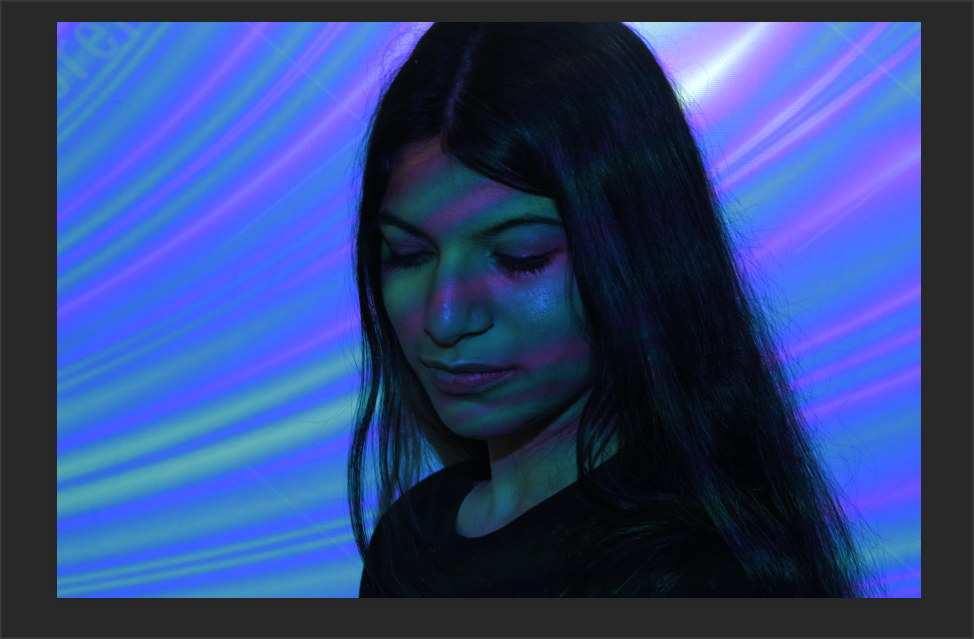
I then lowered the brightness and increased the contrast as I wanted the colours to have a deeper tone, because in my original picture the colours were less pigmented which did not convey my theme of light & dark clearly.


|
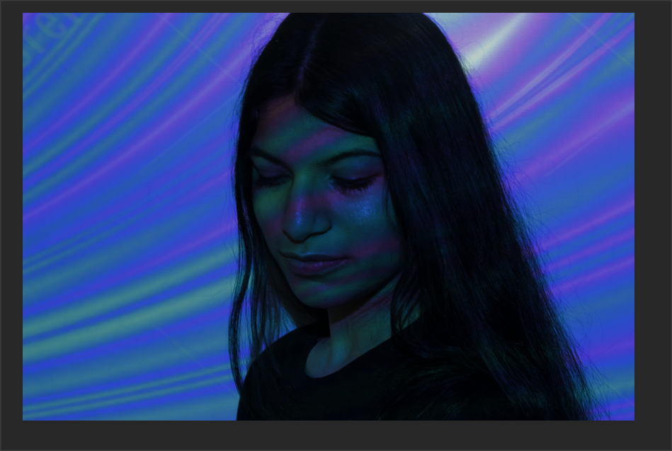
Here I decreased the exposure to define the beams of colour in the background and on my models face. This is a small change yet it has made large impact on my image as it enhanced the colours and the smaller details.
|

|
To make the image more vivid I increased the 'vibrancy' and the 'saturation', this definitely upgraded my image as it highlighted the magenta stripe which was not as prominent previously, thus conveying my theme of light & dark.

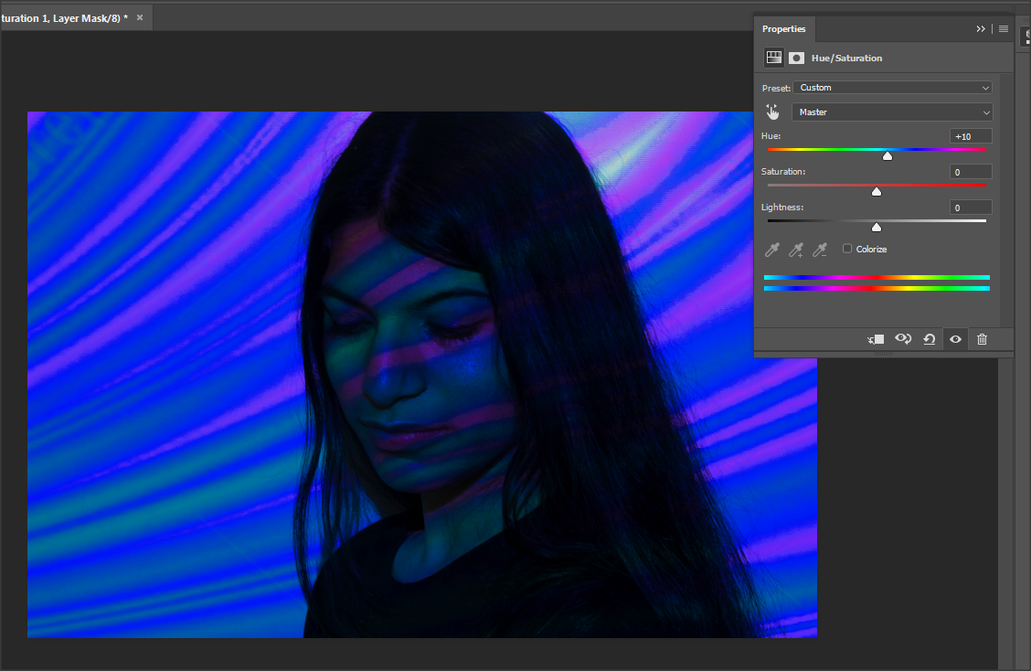
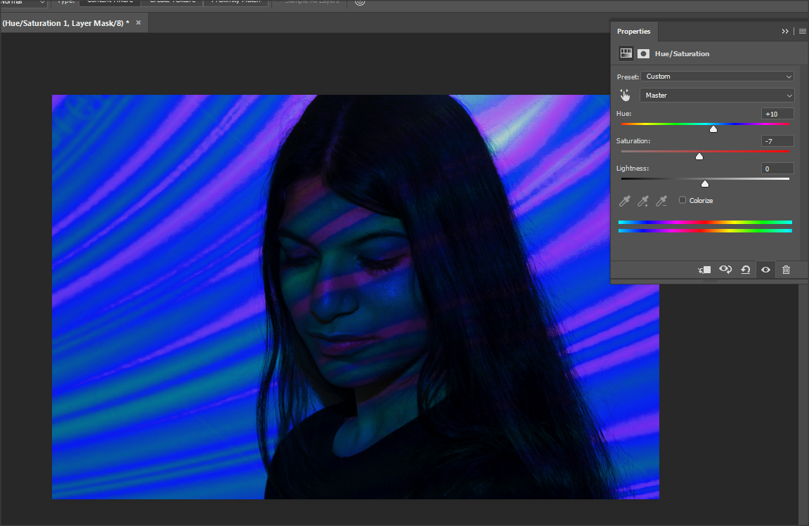
I experimented with the 'hue' & 'saturation' and whilst doing this I felt having the 'hue' and 'saturation' in the middle was not effective. so I slightly adjusted it so it gave a deeper depth of colour, further enhancing my image. However, I am not fond of the developed version with the 'hue' and 'saturation' because it has unnecessarily darkened my image so I have decided not to use it in further development.

|
|
|
|
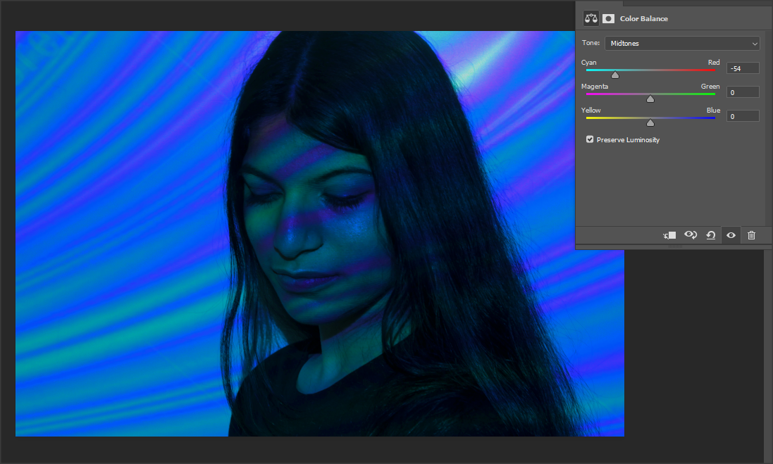
I adjusted the colour balance to further stand out against my models face, but also see if I could differentiate the colours more effectivley.
|
|
When doing this my image became overly shadowed, which I had to increase the exposure to redefine the different colours, specifically the white as the blue over powered it

|

|
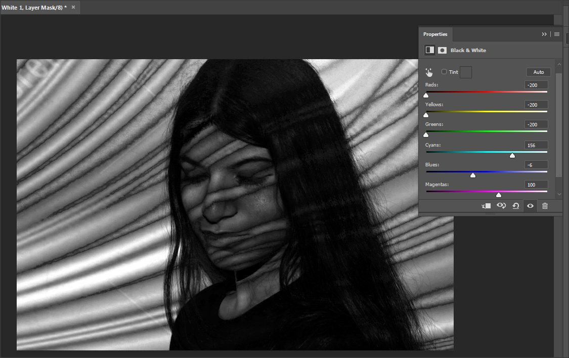
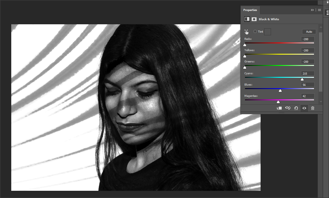
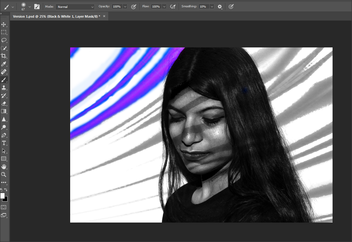
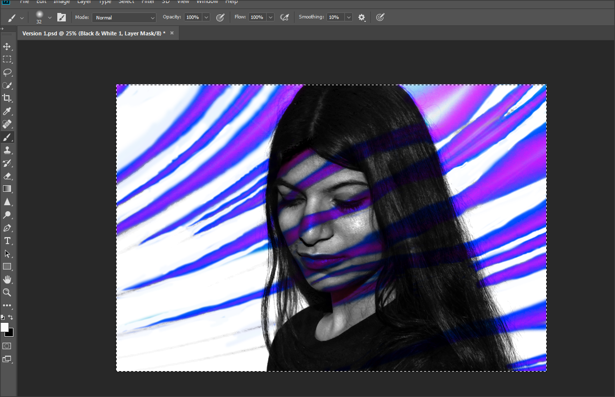
I then went into the properties to erase the colours and make it into a greyscale image, I wanted it to be plain, but I still needed the outline of the strips for what I intended to do next.
|
|
|
|
|
FINAL IMAGE
Shoot Six


Professional Shoot with Photographer
Set Up


Photographs


Black & White


Close Ups


Evaluation
For this project we started by looking at 'Framing'/Light & Dark. I then conducted further research and decided to focus on the theme of light & dark because there is a variation of interpretation and there is a plethora of perspectives on this theme, allowing my work to be distinctive. During this project, I mostly enjoyed experimenting with various setups and
