STATEMENT OF INTENT
I have chosen the theme Landscapes, as I was intrigued by the various interpretations this theme can have. It further allows me as a photographer to develop my creativity, as I have to broaden my range of skills to achieve unique styles of pictures and allow me to have multiple perspectives on a simple theme. In this project I hope to intend to develop and refine my skills in order to be certain I can be successful and confident using them.I aim to create a portfolio that ranges from rural and urban landscapes, expressing the allure of both environments.
To achieve high quality photographs, I intend to carry out a variety of research for my theme, 'Landscapes'. Such as interpreting and understanding different photographers and their images, with this I hope to study their unique styles and ideas, the use of different angles and composition, adding to the range of skills I hope to achieve. A famous landscape photographer that will greatly help my work is Simon Kitchin. He is well known for his landscape photography that is based in Anglesey and other points in North Wales. This will be beneficial for me as I want to visit different places to allow me to develop more of an idea of how different styles of landscapes can be effective such as; visiting rural areas to capture the sky at different times of the day and forests to focus on the different heights, textures and colours of the trees. I hope to seek out many more options in terms of traveling as there are many places I can also visit, to successfully project my ideas for my theme, for example Anglesey and Malham Cove. Furthermore, I will avail any and every opportunity in order to help me create a high standard of images and an outstanding portfolio. In this project of landscapes there are many concepts on how to tackle the theme with individuality, once acquiring the photographs needed. There are many approaches when it comes to landscapes such as pop-art, layering, staining, all achieved through Photoshop refinery, but the theme that I have decided is geometrical.
A photographer who is infamous for his geometrical approach to the theme of landscapes is Legan Rooster, he carves small shapes from within his landscape photograph and then pieces them together to create a larger shape. This is a concept that I am very fond of and to help develop my skills in this Photoshop I will watch tutorials on how to specifically create this effect and I will integrate the skills that I have gained into my work.
I will capture a great variety of photographs to explore my chosen theme 'Landscape'. I will refer back to the artist research that I had studied and interpreted and try to incorporate their work into my photo shoots to add a range of genres and styles of photographs. To further show the influence of my research but also be able to show my personal ideas, thus resulting in showing my scope in creativity. However, my focus is on travelling to multiple locations to capture landscape photographs from urban to rural. I believe this is the most important aspect of the entire project as landscapes cannot be portrayed any other way than going to locations and selectively take photographs. I will also be able to convey my resourcefulness and my creativity through this project as it is heavily independent, as I am in control of how to use my time and assets.
I will use a variety of techniques to enhance my photos such as the use of various camera settings; the aperture to blur my background, depth of field in order to sharpen my images, or shutter speed to capture live moments of my landscapes. To further enhance my images I will use Photoshop a digital technique, to edit my images and empahasise the properties of my image and create a more interesting look to intrigue the viewer using the many tools available for example - the mirroring tool. I plan to create geometrical shapes with my photographs to create an overall shape, this is a popular concept used by many photographers, one that I aim to incorporate into my work.
TIMELINE Q MISSED
As my work progresses I will create galleries to present my work and separate them into two sections; rural and urban, to show that I have met my objective of showing the contrast in the landscapes. When I refine my work through Photoshop, by incorporating my artist research as I will most likely use the geometrical concept that Rooster has used, I will make sure to show the process through screen-shots and show my finished results and use my own work as basis of my progression, by analysing my work to ensure I do not make previous mistakes again. This will help me improve and definitely allow me achieve the best of my ability as I am incessant when it comes to improving my work. In the end I will write a final evaluation, reflecting on the entire project, the strengths and weaknesses and what I could do further enhance the quality of my content.
ARTIST RESEARCH
Simon Kitchin
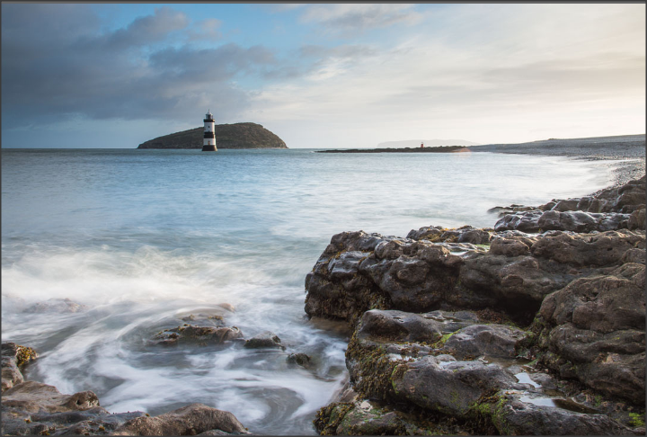
Content & Composition
This is a landscape image consisting of a rocky shore which is closer to view and a body of water which stretches to the back of the image, the water going from a foamy white to a light blue as it reaches further back. There is also a lighthouse present in the distance which appears to be smaller due to how far it is, compared to the rocky shore, and there is a colossal rock directly behind the lighthouse. The photograph seems fairly new as it seems that it has been taken on an advanced piece of technology due to the clear capture of the foamy effect of the water closer to the viewer, this most likely would require the use of a modern camera to capture this effect as it is a more complex subject compared to older cameras which do not focus on such details. The photograph has a fair amount of colour, but not much range as there are mainly just blues for the sky and water, greys for the masses of rock and the sky and also some white again for the body of water and the sky. However, others may argue that if you look very closely at the top right corner of the sky there may be a hint of pink, but if so it is very faint. There is also a small of green as there is fungi on the rocks close up which is evident but also subtle. In the left corner of the sky there is a much darker shade of blue and hints of grey creating a more bleak look, which contrasts the image entirely as it has tranquille mood to it. The fact that there are no people or any other animals of such, it makes the place seem quite isolated, but the use of the colours light blue and white do not create a melancholic tone to it but rather the opposite, making me feel that it is a peaceful place. Clearly, rule of thirds has been used in this photograph as the light house in the distance is on a sweet spot, making it the most significant part of the image. The rocks are all on the right making the water seem like it stretches out further, this could also be because the photographer has taken the photograph just slightly lower than regular eye level. It is also evident that a tripod has been used as the water looks smoky, which is clear that a slow shutter speed has been used to create this effect, a slow shutter speed can only work properly on a tripod. The use of a slow shutter speed has made the rushed water look white which greatly contrasts the brownish/grey colour of the rocks but also the colour of the water further back in the image, which is a light blue, the photographer may have used Photoshop to make sure the different shades of blue to capture a perfect blend which is pleasing to the eye. Also around the image in the distance is the shore/land which looks like it is curving around the water which also creates a leading lines.
Context
Kitchin is an award winning photographer whose work has been featured in various magazines and books. His landscape photography is also on a permanent exhibition in several locations in North Wales and also guides other photographers by holding photography workshops in multiple locations like The Isle of Anglesey, Snowdonia National Park and the North Wales coastline. He specifically uses the Nikon D800 full frame DSLR to achieve his infamous outocomes, alongside using a range of Nikon lenses and Lee filters. Kitchin has always had a passion for photography but it was due to his relocation to North Wales in 1997 that truly influenced his career in photography. Due to his change in location, Kitchin was truly able to explore the beautiful coastline of Anglesey and the stunning mountains of Snowdonia, which allowed him to become more devoted to the craft of landscape photography. Kitchin also has a blog, fotovue.com, where he shares photographs of the locations he has been to and the workshops he holds. He is also the author of the fotoVUE location guidebook, where has pieced together his photographs of North Wales.
Connection
It is evident that the theme of this image is landscape as it captures every essence of a typical landscape portrait, which is relevant to my work as my theme is also Landscapes. It links directly to my work as I plan to create similar outcomes as the photographer has, which is capturing the tranquility and beauty of nature. The photographer has executed this very well, as the image conveys the essence of nature through a landscape image, without jeopardizing any element, every element of the image is unique, from the white foamy waters which becomes blue, the rough edges of the rocks and how powerful the sky looks. I also intend to focus on the beauty of nature throughout my work and this image has definitely inspired me to take images in such a way that all components of the image need attention not just the subject.
Comment
I enjoy viewing this image and I believe that it has many strengths, the main aspect of this image that I am very fond of is how the texture and colour of the foamy water and the rocks are portrayed through the image. It has been captured so clearly that I can almost feel the textures. The colours also contrast greatly as the white against as the brown-grey clashes but also portrays the constant change of nature, because these two colours contrast the rest of the colours compliment each other very well, creating an overall rounded picture. Although the image is beautiful and simple, it can be seen as boring as the main focal point, which is the lighthouse is so distant and there is not much else to view. Furthermore, the colour of the clouds and the element of colour in general in the image is quite lacking as there is no range, there are just multiple shades of blue and grey and hint of green. If the image was captured at sunrise or sunset there would be a much greater range of colour from oranges to pink etc, these colours would most definitely reflect on the water further creating a more interesting image to view. I can certainly use this as inspiration as I believe this image was taken in Anglesey, where I plan to go and hope to take similar outcomes such as this. Overall, I believe this is a very well composed and beautiful image and a message that I feel is conveyed is how alluring nature truly is if not tampered by humans, due to the fact there are no people in the image. But also how powerful nature also is, the clouds and the water stretch further beyond what is seen in the image showing that nature is eternal compared to human existence which is ephemeral.
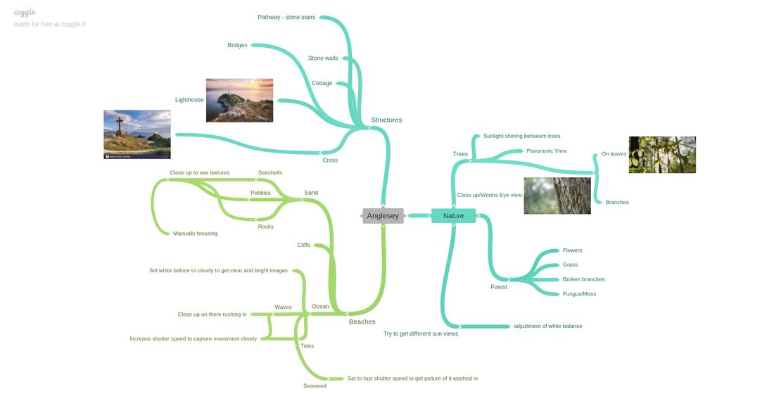
Coggle Mindmap
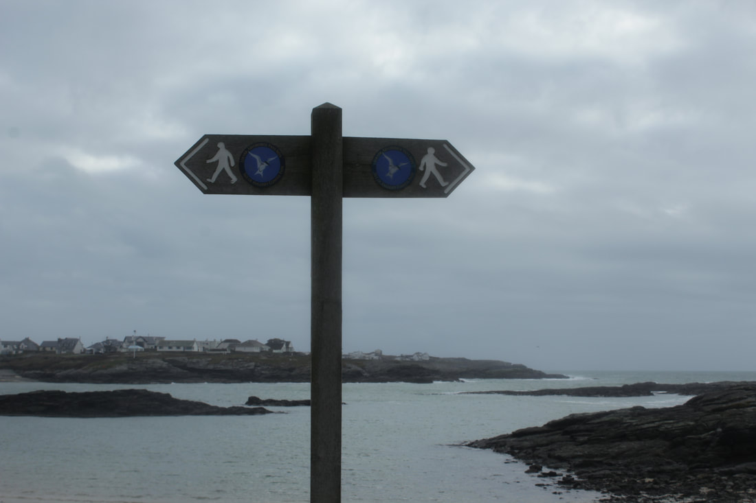
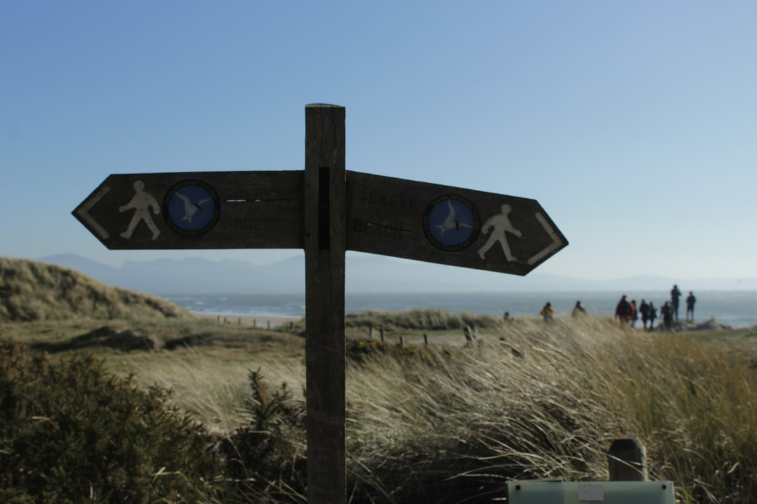
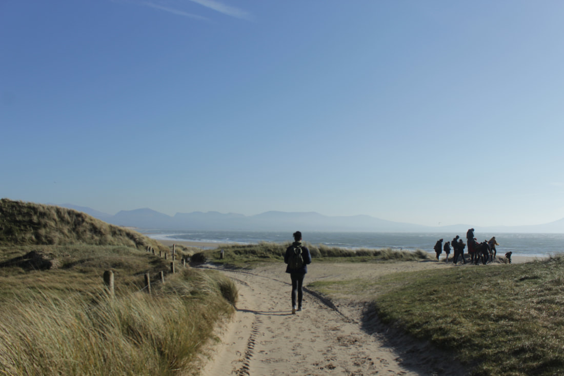
RURAL
Grassy Beach
|
|
|

Best
I thoroughly enjoy looking at this photograph, as the composition is harmonious. I like the fact that the sign that is slightly tilted downwards, is coincidentally pointing at the group of people. There is also a medium depth of field here, as the sign is completely focused, however the back ground which consists of the ocean, grass, sand and people are obscure. The clear blue sky also contrasts to the green in the grass and the oak, brown colour of the sign which further makes the image attractive.
|
Worst
I am not as fond of this image as I believe that the composition of the image is not strong, as it is imbalanced. Furthermore, the land masses are not flattering in the image as it also looks slightly tilted angle and the white balance is too cold, creating a dull look to the image,
|
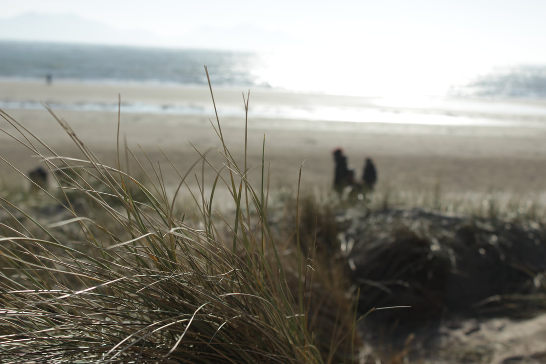
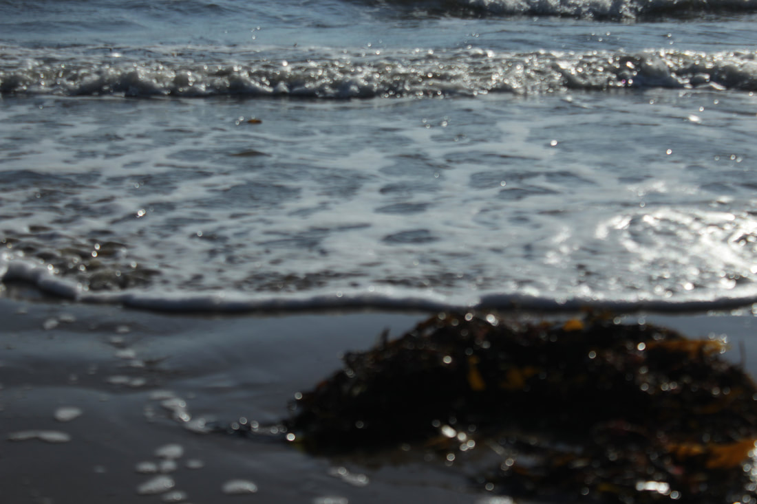
Seagrass' Froth
|
|

|
Best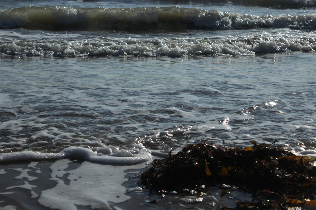
This is my best image as the picture is clear and crisp and I captured this image while the wave was crashing and the sea foam was disintegrating, I achieved this by setting a fast shutter speed. I also used the rule of thirds making sure the seaweed was in the bottom right corner rather than the middle or left, I feel that the composition balances the image and is not overwhelming.
|
Worst
This is the worst image as it is not in focus, the composition is also terrible as it is randomly in the middle and is also on a slant making it unappealing.
|
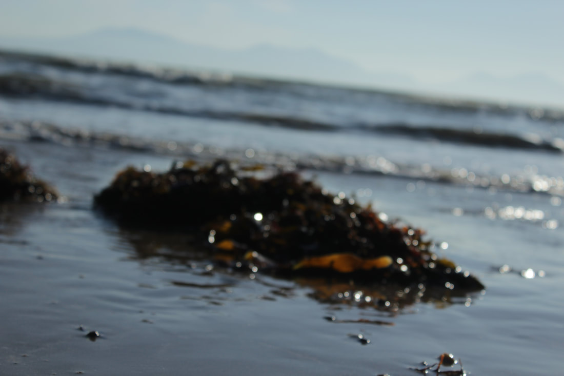
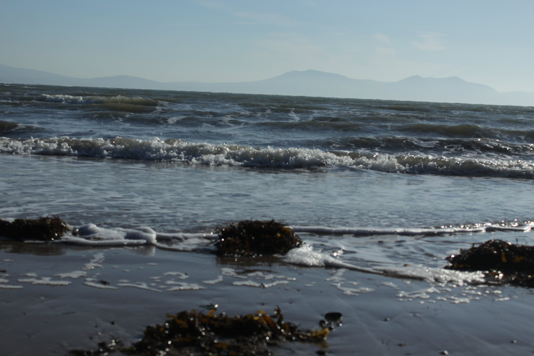
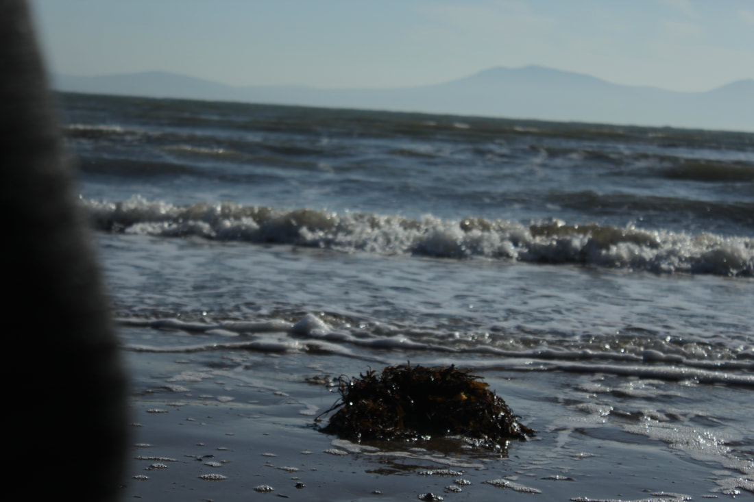
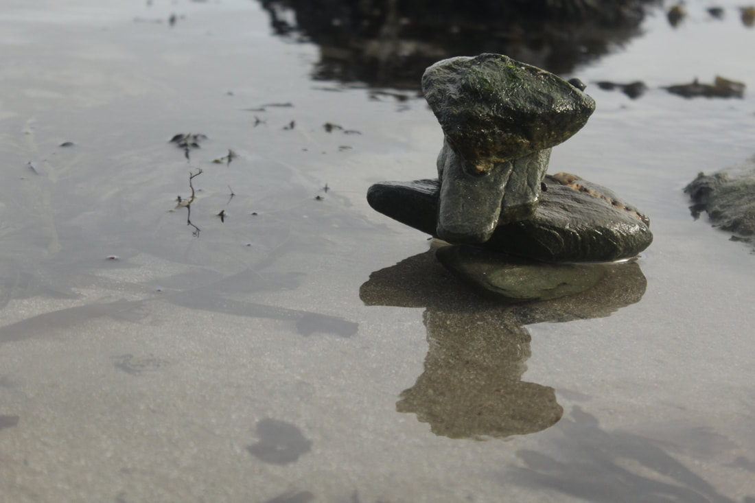
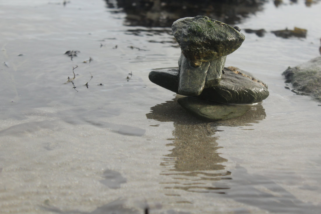
Rocky Coast


Best
This is the best image as I believe that it is composed very well as the rocks are the subject and are crisp clear. I also like how the 2 rocks are in focus and even the smallest strands of grass are in focus, but the lighthouse is not focus but this is what I wanted as I did not want the lighthouse to be the subject but still want it to be prominent to the viewer.I did this by using a medium depth of field to blur the background and also took at at a worms eye view.
|
Worst
Although the image is quite clear , the image is quite boring as the lighthouse is cut off which makes the image quite useless as there is no subject. The cliffs on the bottom right is also cut off and the image overall is quite dark meaning that I need to adjust my ISO and white balance.
|
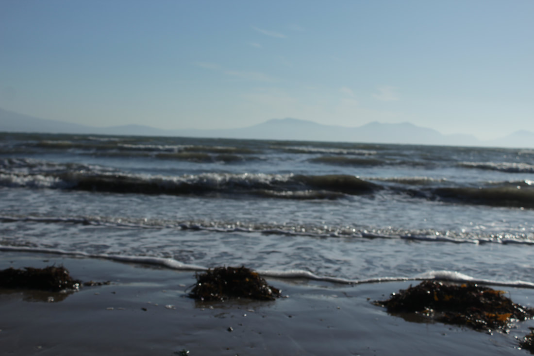
Breathing Tidal Surge


Best |
Worst
This is the worst as it is not in focus and is blurry. Although I like how the waves are moving.
|
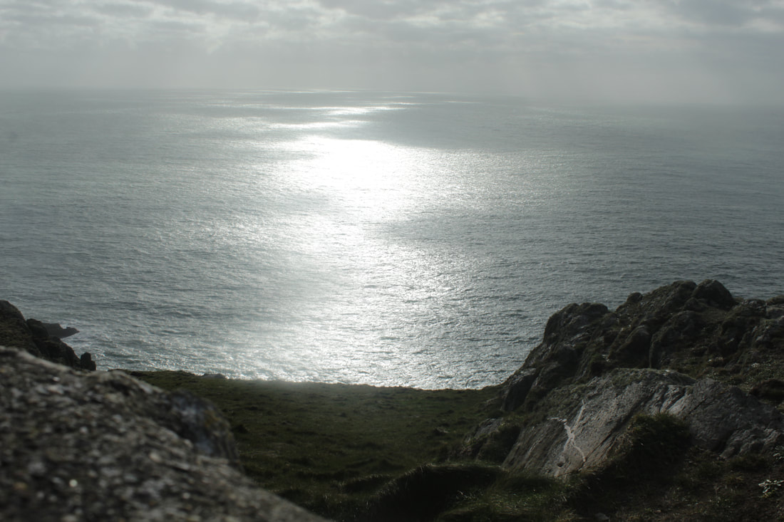
Seeping Rays


Bare Bark


Nature's Nirvana


Shelly Shore


Fungal Lake


Rocky Valley
|
|
|


|
|
Lighthouse
|
|
Drew Buckley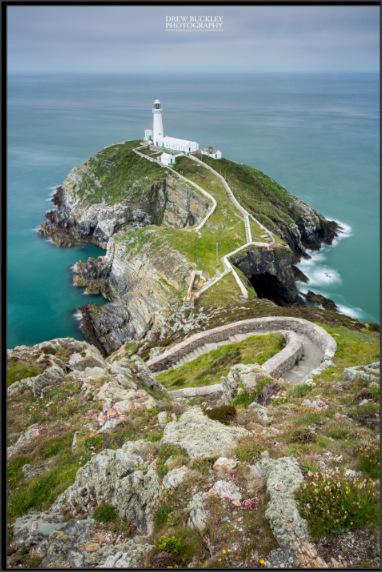
|


Jelly Carcass


Our first trip was up in North of Wales, Anglesey, in mid February earlier this year, whereas our second trip to Salford & Manchester was in mid July. Just the two different timings of the trips drastically changed the outcomes of the photographs I took, as Anglesey was in Winter and Salford was in Summer. The fact that we were able to go on two separate trips in two opposed seasons clearly showed how the effect of weather has an impact on the quality of the photos. When we made landscape pictures in Anglesey the lighting gave a bleak look to the pictures, but at times there would be warm tone to my photographs because of the sunlight. As opposed to in Salford where the sun gave a vibrant tone through out all of my images which helped show that the seasonal differences influenced the images. In our trip to Salford & Manchester the sunlight was quite harsh that day so we had to constantly adjust our camera settings mainly the exposure and white balance to get visible and clear photographs. We similarly had to also adjust the settings in Anglesey too, but because the pictures were coming out darker and dull, both exposure and white balance also played a crucial part in high quality outcomes. The incessant need to change the camera settings has definitely sharpened my skills as a photographer, as now I am confident in adjusting the setting to get a clear image. Furthermore our trip to Angelesey was truly uplifting as the views and the landscapes in more of a rural areas are not seen as much in the city. I believe the trip to Anglesey has heavily impacted the standard of my portfolio, as I was able to capture naturalistic images there, as compared to Salford & Manchester. It also gave a lot of variety within my work as Anglesey is more rural and Salford & Manchester were more urban, it has given a contrast to my work and shows that I am able to adapt in both environments and make equally excellent images too.
URBAN
MANCHESTER
&
SALFORD
Hilton
|
|
PHOTOSHOP INSPIRATION
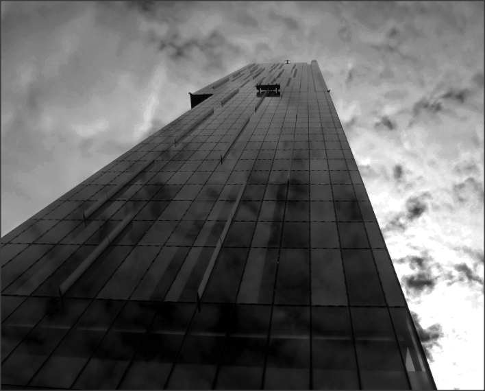
This breathtaking photograph is by David Butcher, and I aim to make an image like this, of the Hilton from worms eye view, looking up to capture the reflection of the clouds on the building, but also for other building that are reflective.
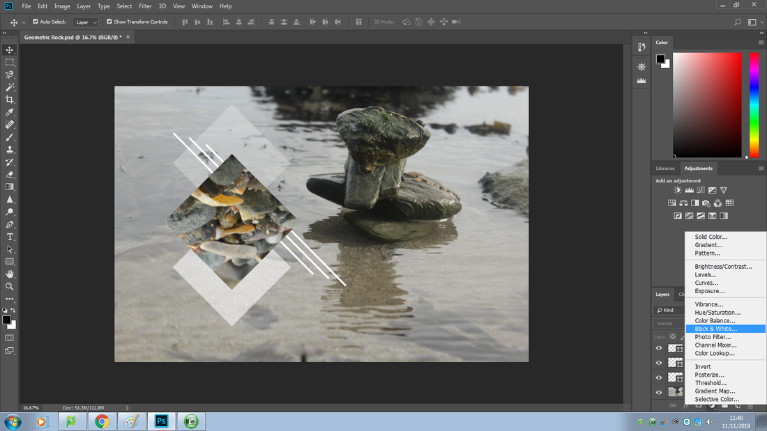
The theme that I intend to do is is black and white, I specifically want to do this for the pictures I took of the reflective buildings, as I feel that it will greatly enhance the beauty of the images. Black and white gives a very elegant look to photographs if used correctly and I aim to produce sophisticated photographs by doing so. |


Photoshop Process
Original Image

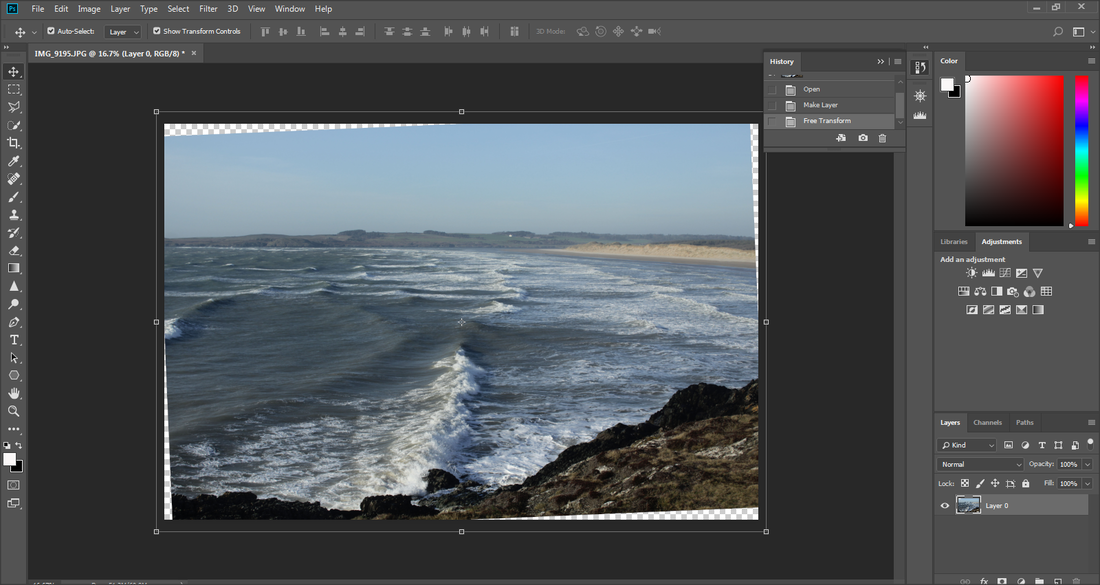
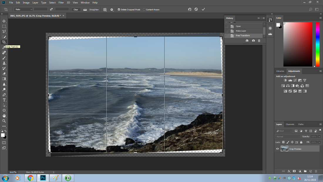
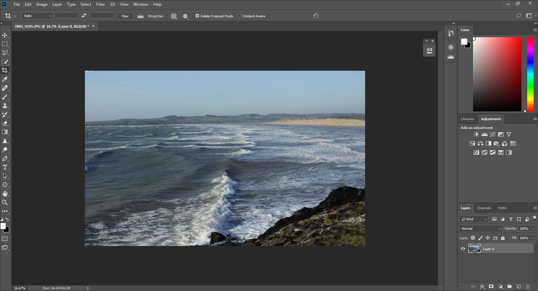
I decided to crop it as I felt that the image was not at a flattering angle that way and it would look better if I cropped and zoomed more into the building.

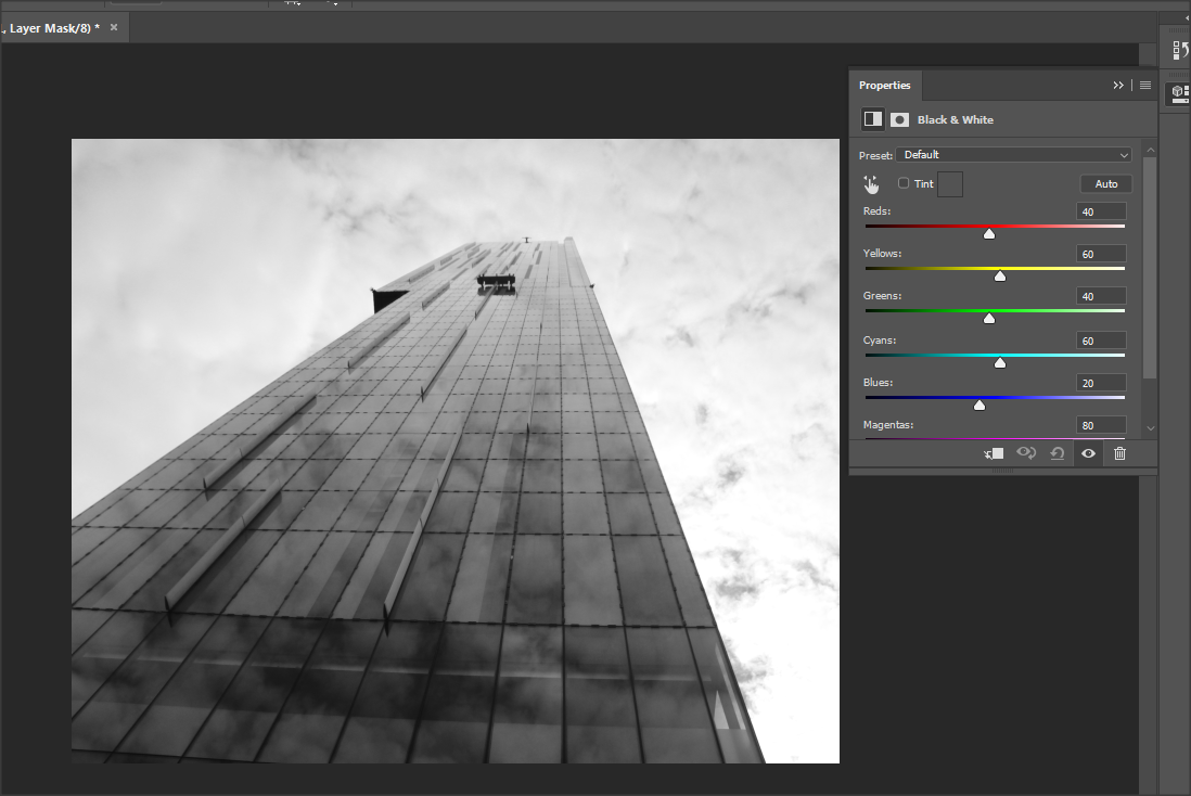
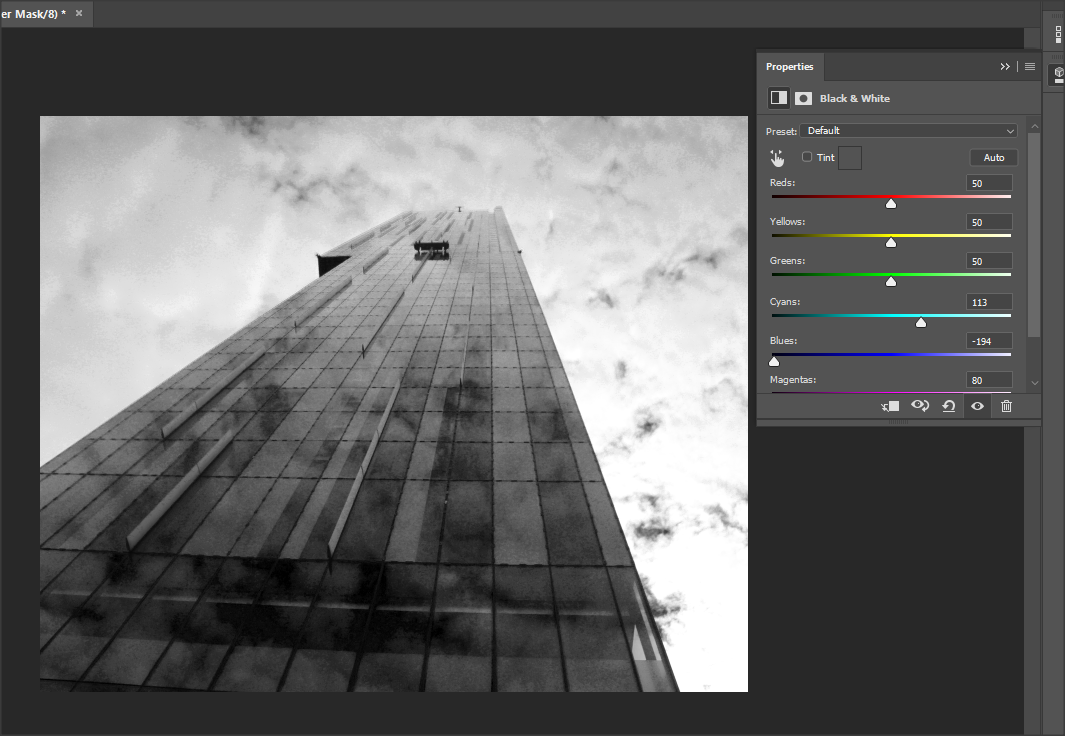
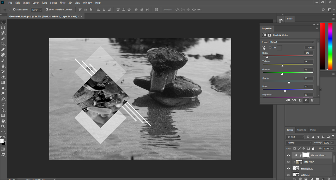
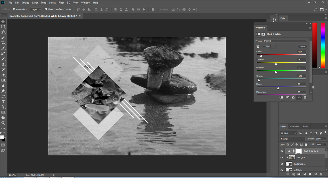
I then decided to put the black and white filter on and adjust the different colour tones to get the right tone on the image. I also wanted the cloud reflection on the building to be more apparent and visible.
|
|
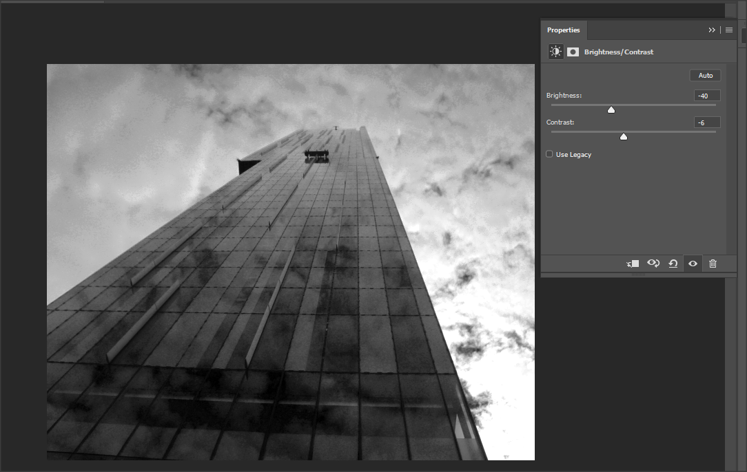
To make the clouds reflection on the building more apparent and visible, I decided to adjust the brightness and contrast, I did not want a vibrant tone to this image which is why I decided to keep the brightness low as it gave a somber and bleak atmosphere, which is what I intended to do.
To further emphasise the bleak atmosphere that I wanted to create, I decided to play with the colour levels, but when I increased either black or white it either became too cloudy over the image or too dark, so I decided to keep the outcome before this.
Too cloudy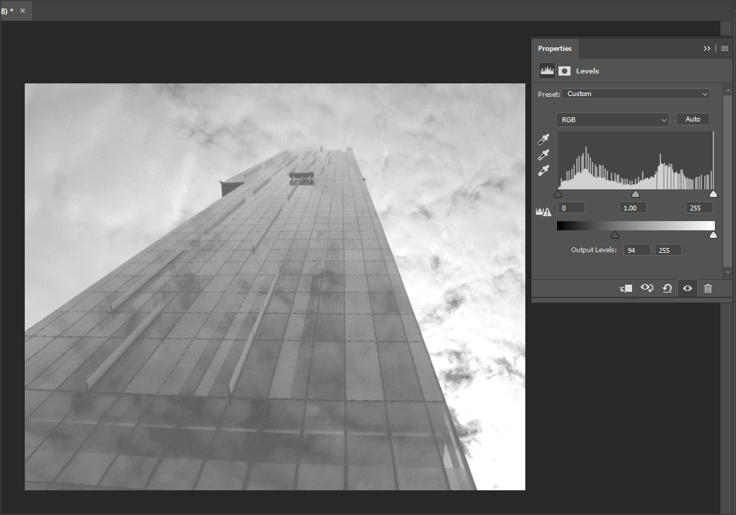
|
Too dark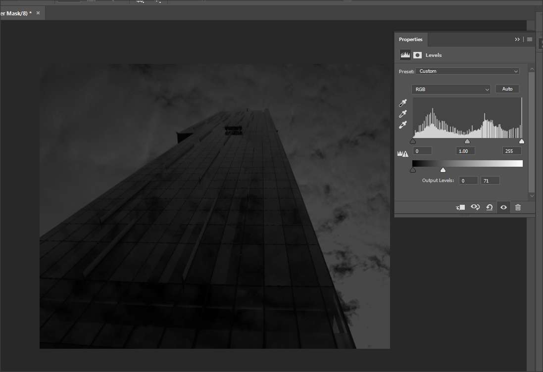
|
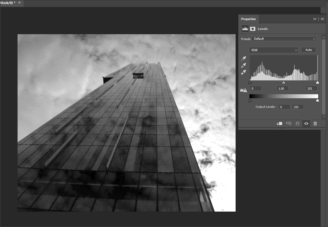
Here is the image I decided to keep and further enhance.
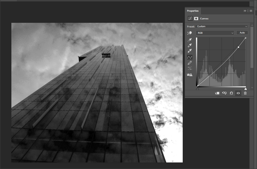
Here I very slightly adjusted the curve to make it just slightly more darker, as I felt that it helped enhance the colour of the sky that was not covered with clouds which I felt that it added to the bleak look I want and further make the cloud look more powerful.
|
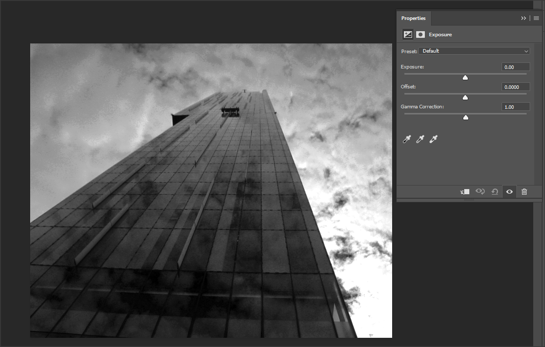
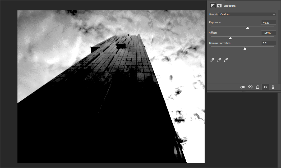
I then decided to experiment with the exposure.
|
Here when I moved the different keys of exposure, offset, gamma correction, I realised it was too over exposed and it was not appealing.
|
|
|
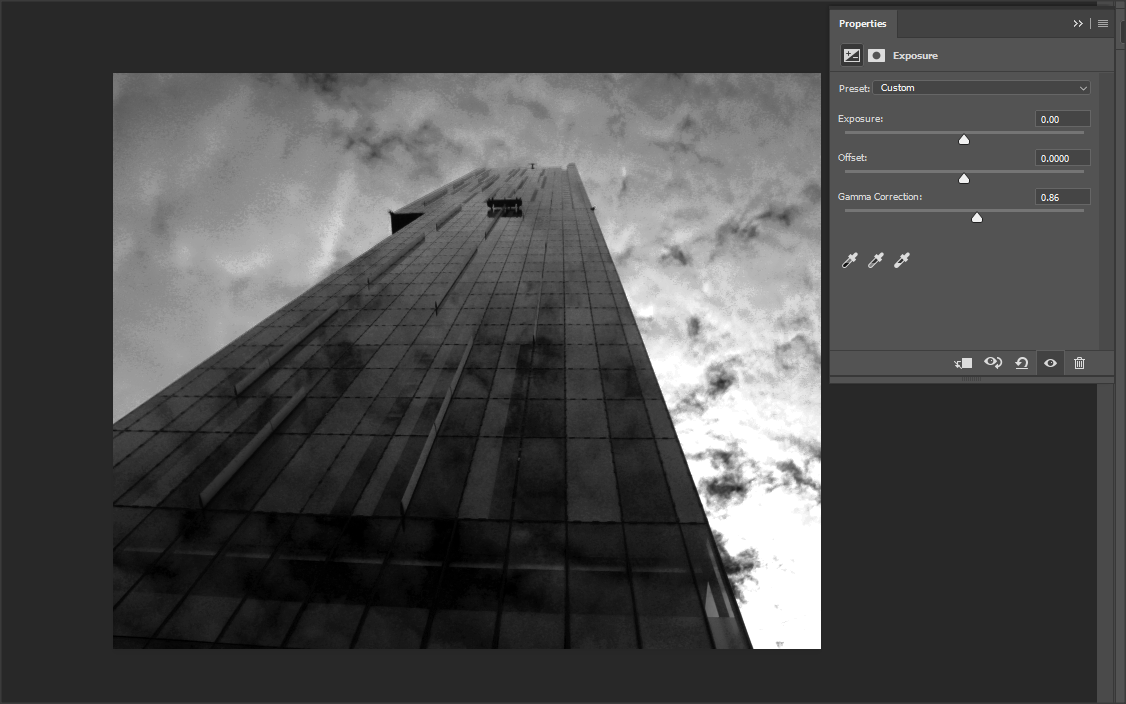
I then further experimented with exposure and came to the conclusion to keep the exposure and offset neutral and just slightly move the gamma correction to the right to add the right amount of exposure to the image. I did this because with the other tools the amount of light and darkness affected all of the image, whereas when using the exposure, it mainly affected the building more than anything else which is what I wanted.
When experimenting with the vibrance I concluded that it made no difference to the image.
Before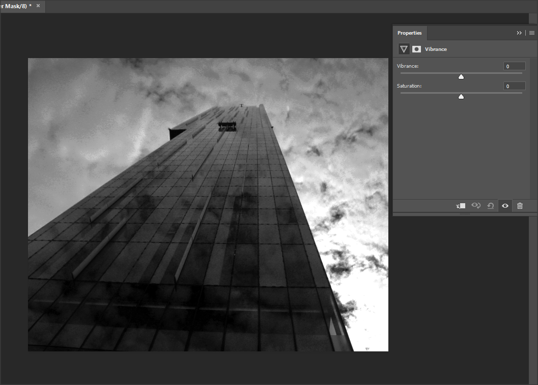
|
After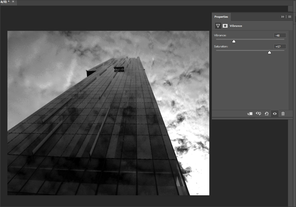
|
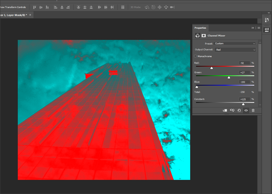
I then decided to experiment with the channel mixer to see if the image would look more appealing if a colour was added. When doing this, I realised that it made my image look cheap and it ruined the theme of black & white which I was going for. I also believe that it it took away the bleak look I wanted to create and created more of a pop-art look which is not the theme I wanted, although it looks effective, I just don't think it fit my theme and I decided to not go on with it.
I determined that there was no further way to enhance my image colour and settings wise, but I noticed that it was quite grainy and reduce the noise to make it more clear.
Before
|
After
Here I went into the filter menu and clicked onto the 'noise', I then pressed on 'reduce' noise to make the image more sharp and refined.

|
FINAL OUTCOME
Panoramic City View


Reflective Infrastructure

|
Before adjusting it was extremely over exposed and bleached out. After adjusting the exposure and changing the white balance to 'sunlight' it made the image visible.

|


|
|


Nature in the city
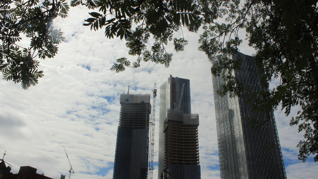


Patterns made with structures


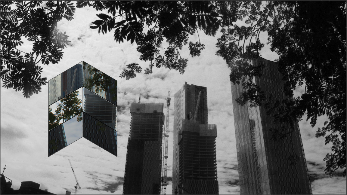
GEOMETRIC SHAPED PHOTOSHOP
|
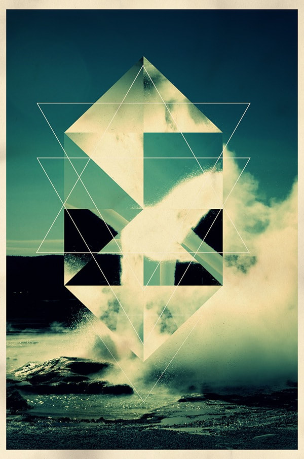
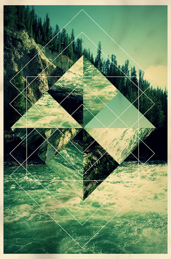
The photographer I am inspired by is Legan Rooster who has made these fantastic images.
I aim to produce eye catching images just like these, by using geometric shapes to frame the images I add inside of them over another image to use a background like Rooster has. |
|
Attempt 1
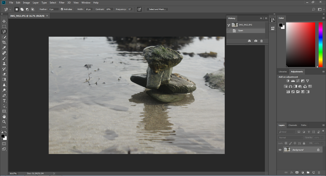
Original Image
|
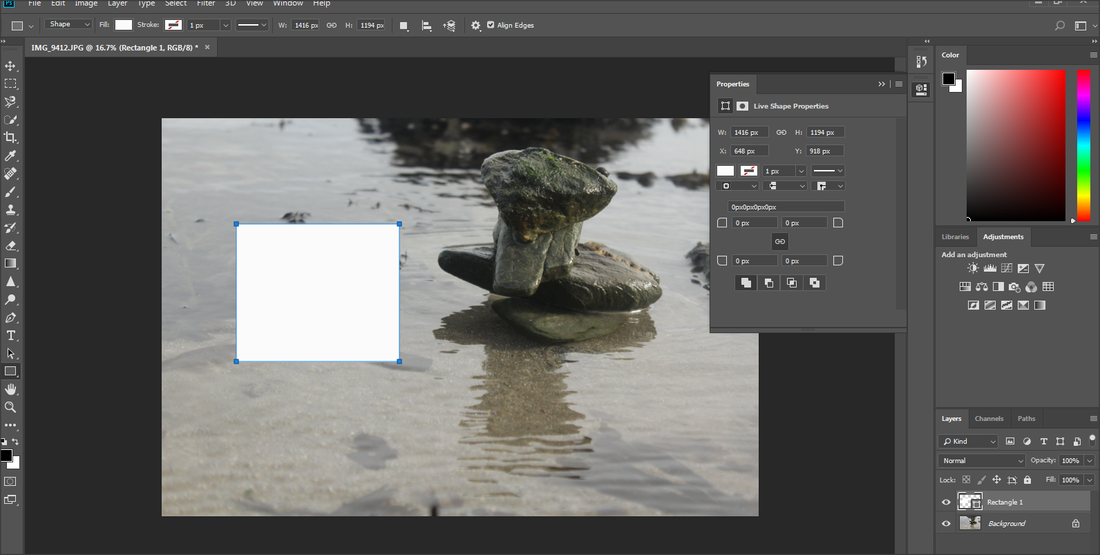
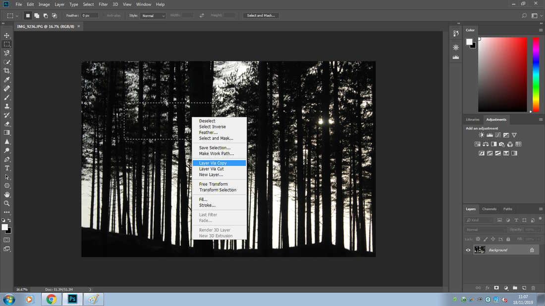
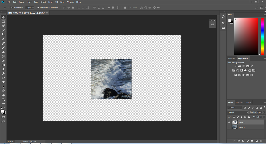
I picked this image as my background and the selected the 'shape tool' > 'rectangle tool'. I pressed shift through out the making of the shape to make sure it did not snap or come out uneven and to make sure it came out secure.
|
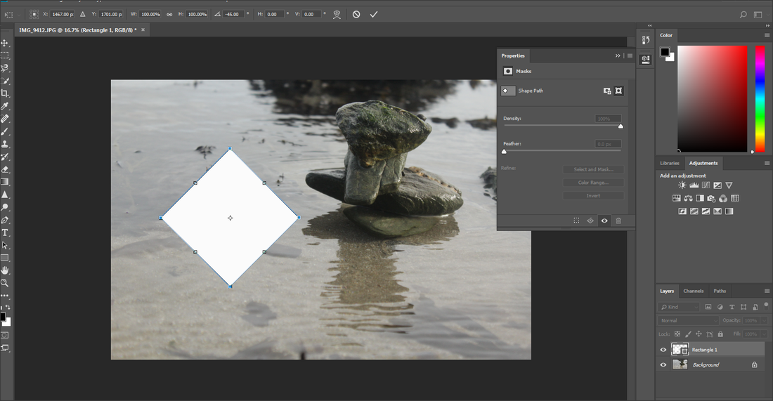
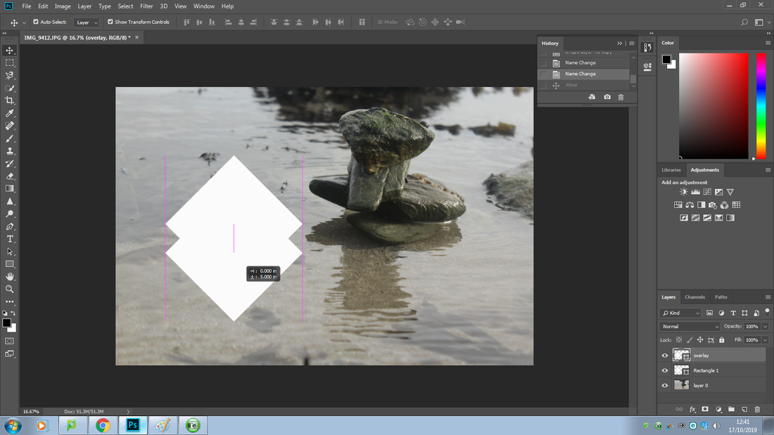
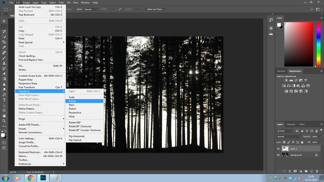
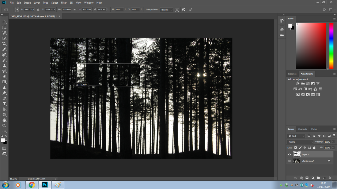
Here to make a diamond shape I pressed 'Ctrl T' and then held 'shift' while rotating it to get a precise shape.
|
|
|
|
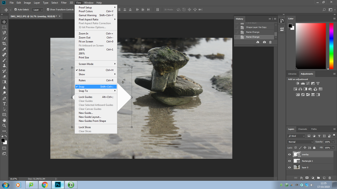
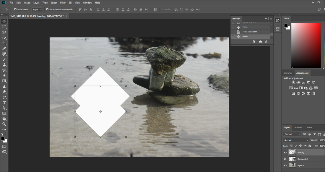
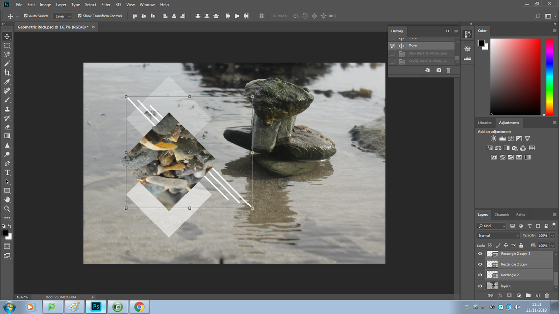
To duplicate the layer I pressed 'Ctrl J' and then went into the 'View' menu to make sure the snapping tool was on to make the moving of the duplicated layer easier.
|
I then pressed the 'shift' key while moving to make movement of the duplicated layer precise.
|
|
|
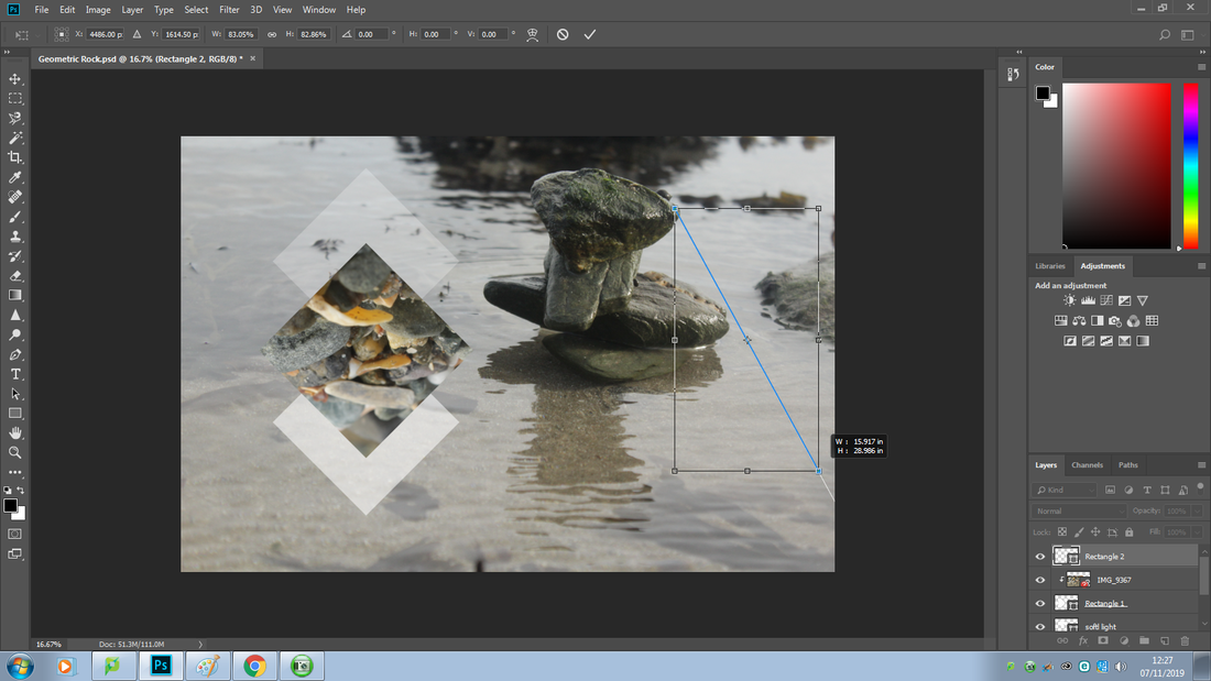
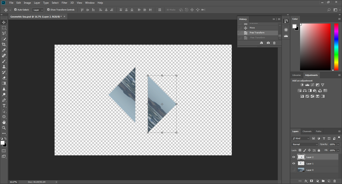
To the resize the duplicated shape I pressed 'Ctrl + T' and then dragged the shape from the corner while holding 'Alt + Shift' keys, this helped me make the duplicated layer just slightly smaller than the original shape.
|
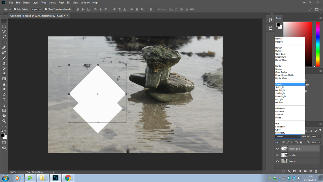
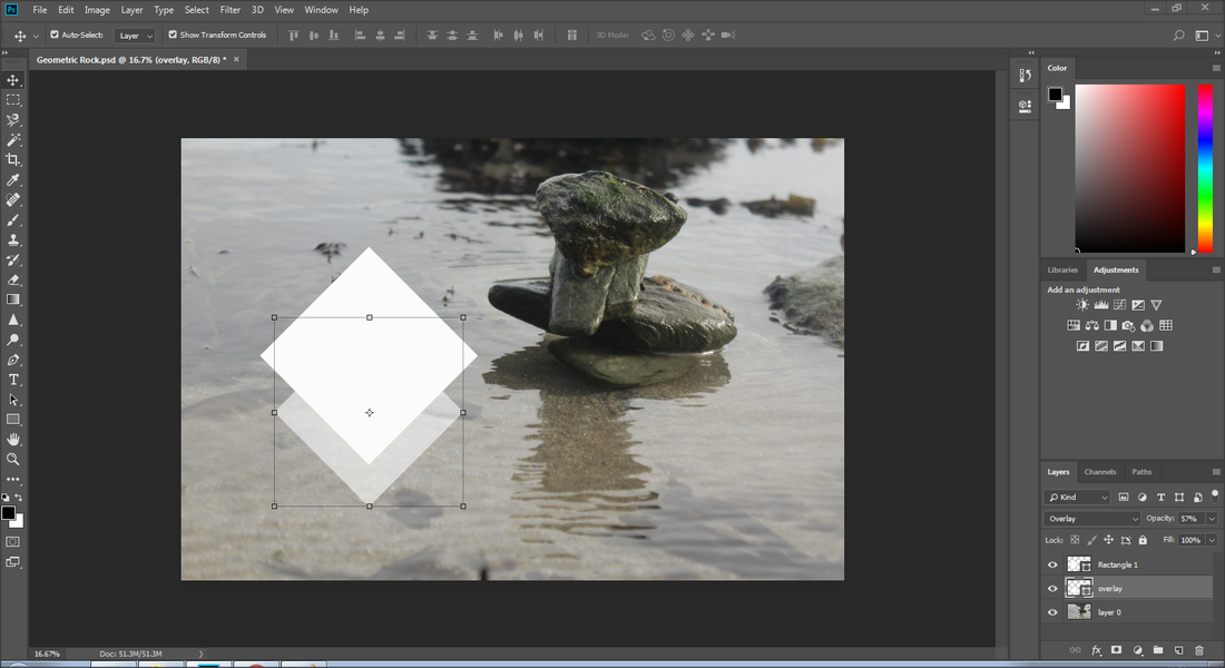
I then change the blending mode to 'overlay' to make the duplicated layer faded rather than opaque.
|
I realised that it didn't fade as much as I wanted to say I decreased the 'opacity' to 57%.
|
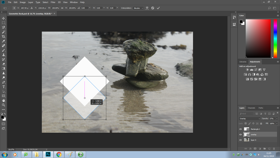
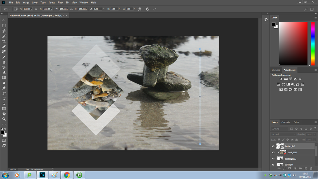
I then slightly adjusted the shape to where I felt it best fit bu pressing down the 'Ctrl + Shift' keys.
|
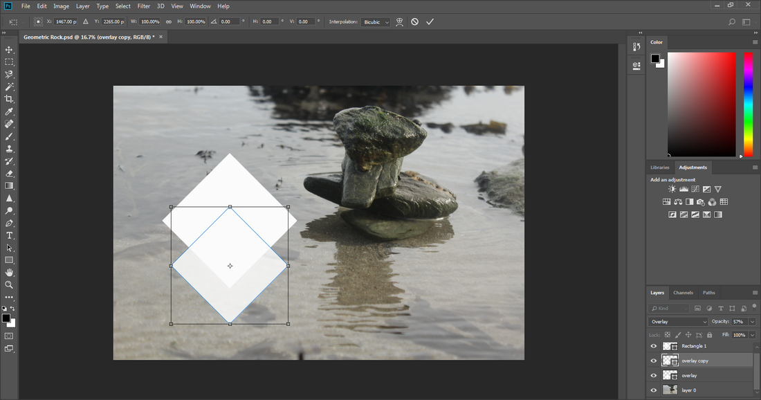
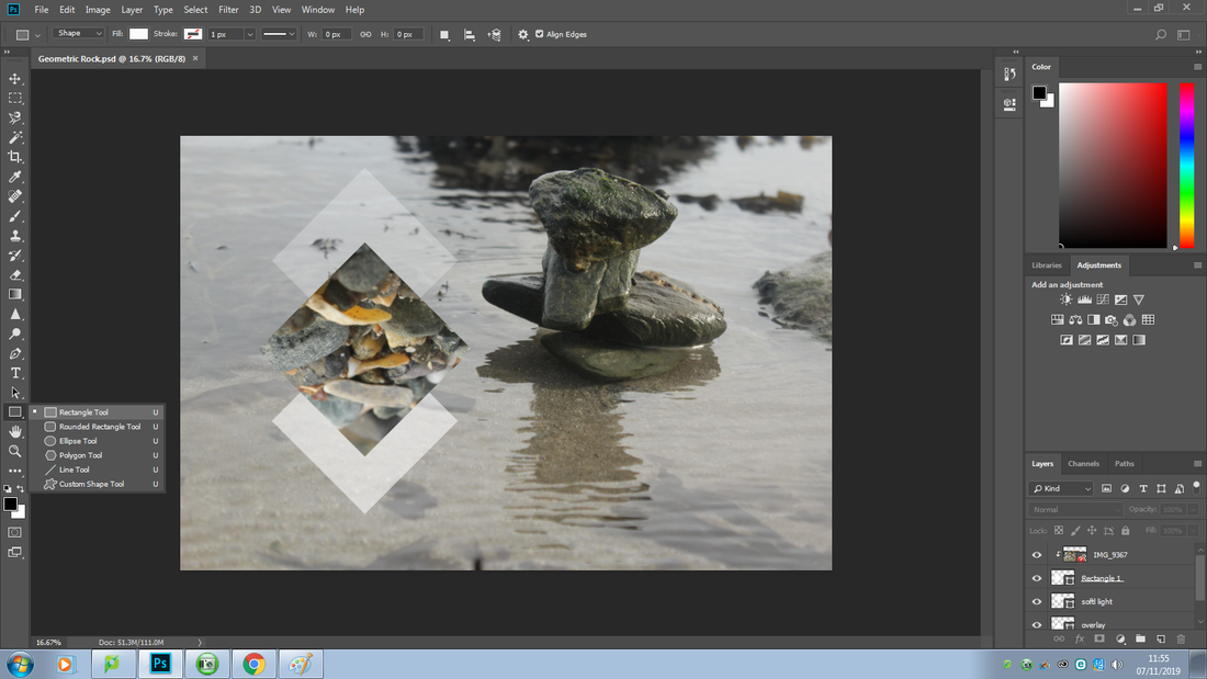
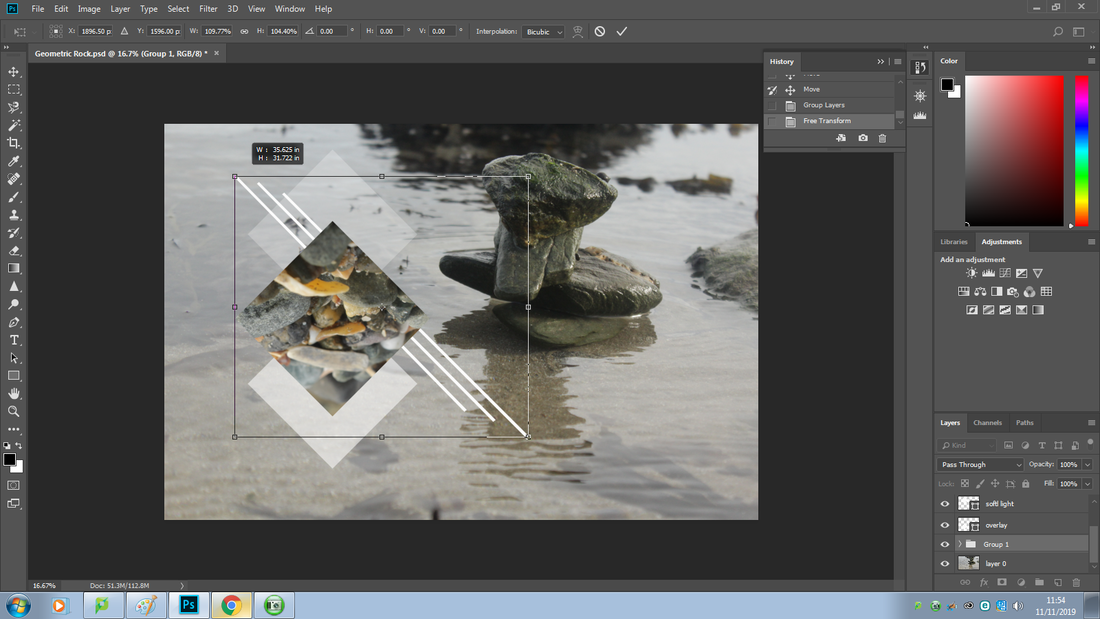
I then repeated the of duplicating another shape just the one above, I made sure the 'overlay' layer was active pressed 'Ctrl+ J' to duplicate it and I called the copy.
|
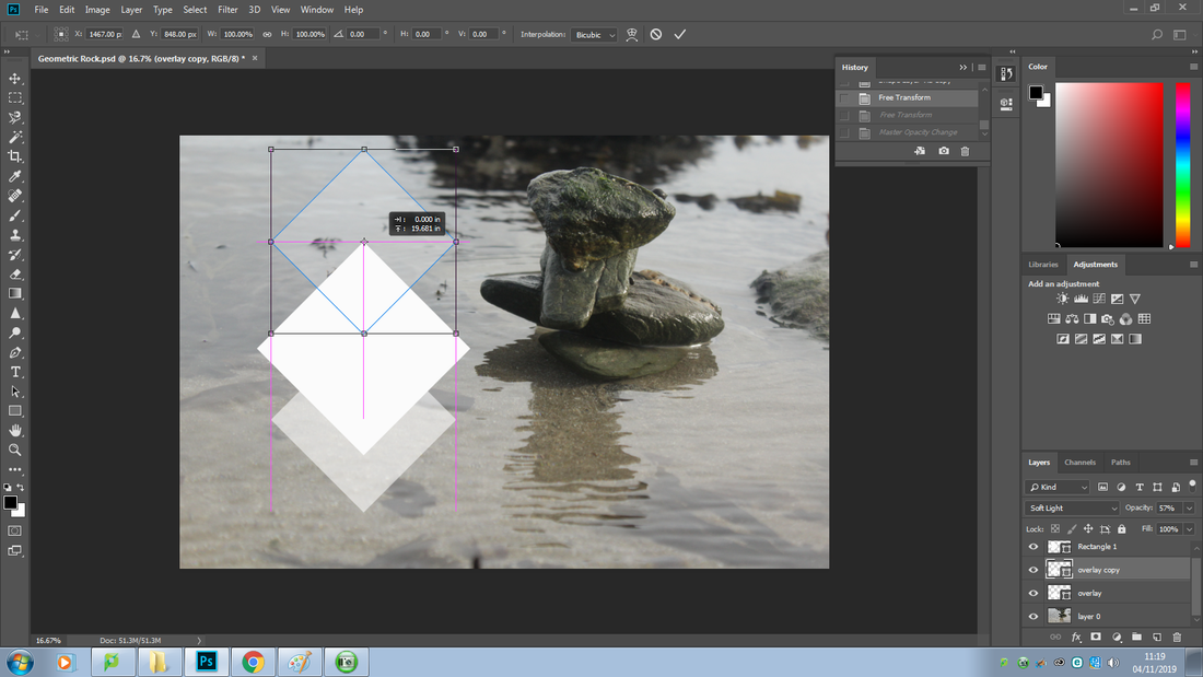
I then adjusted the shape to where I wanted by holding the 'Ctrl + T' keys. changed the name of 'overlay' cop to 'soft light' as I changed the blending option to 'soft light'.
|
|
|
I changed the name of 'overlay' cop to 'soft light' as I changed the blending option to 'soft light'.

|
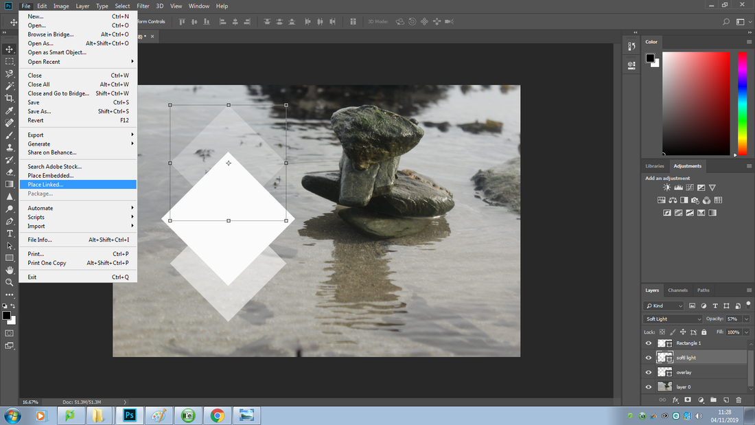
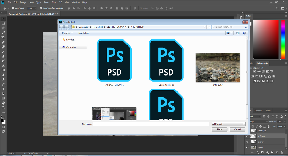
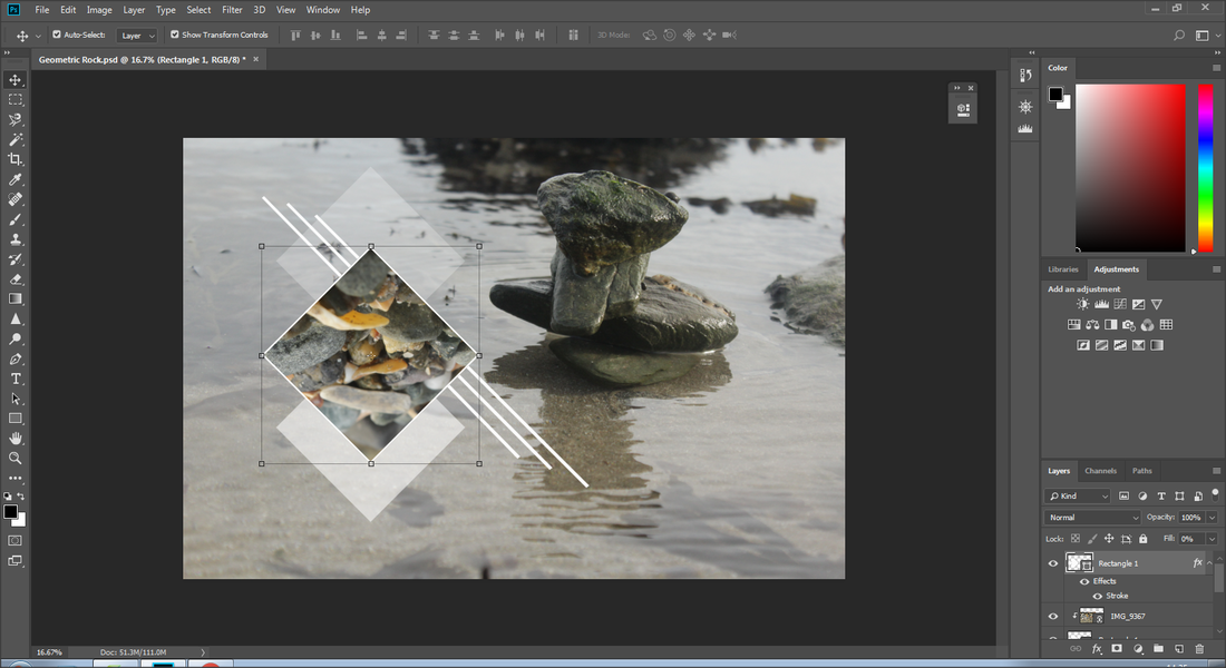
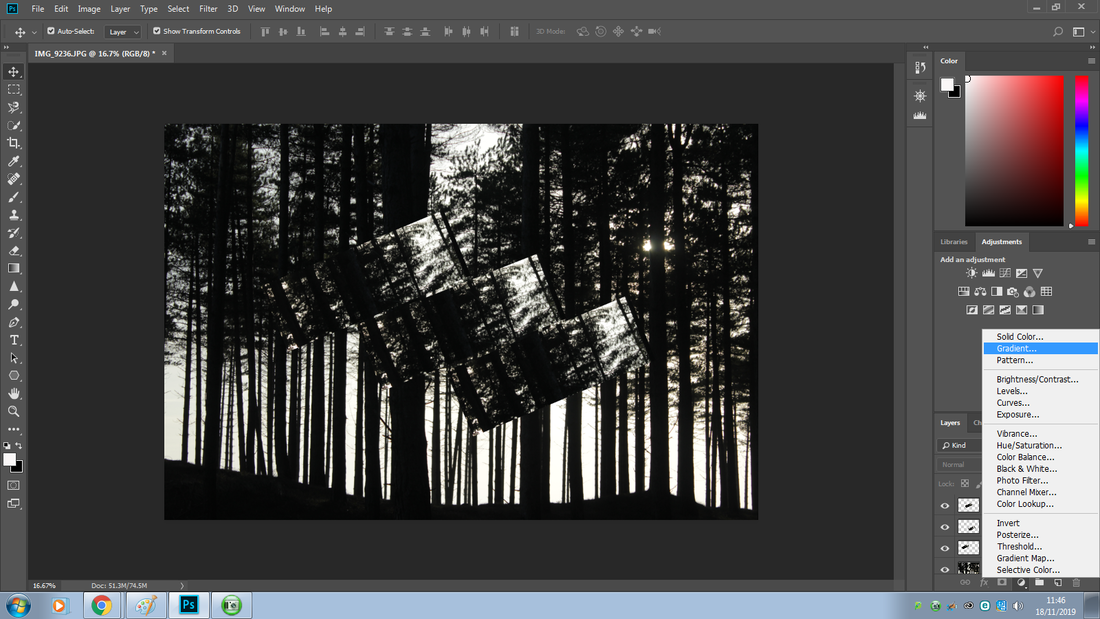
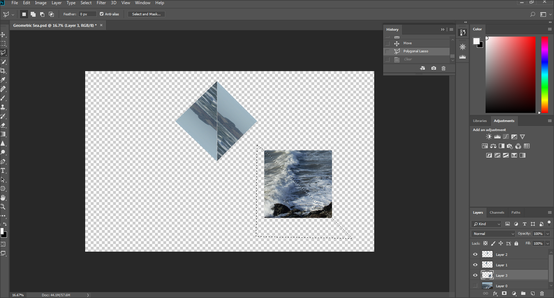
To get an image placed in the main shape I wet into the 'file' menu and into 'place linked'.
|
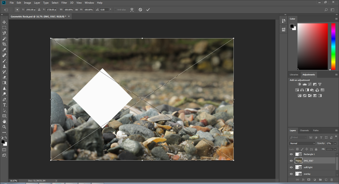
In the 'placed linked' file I moved the image I wanted into there so it would appear there. (Image of rocks)
|
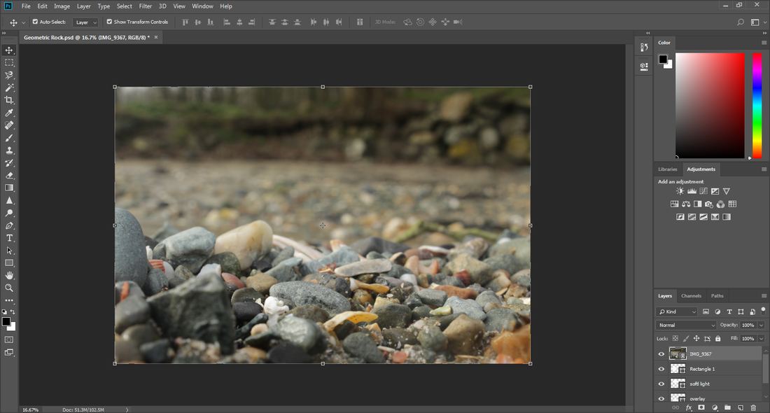
Here is the image that loaded.
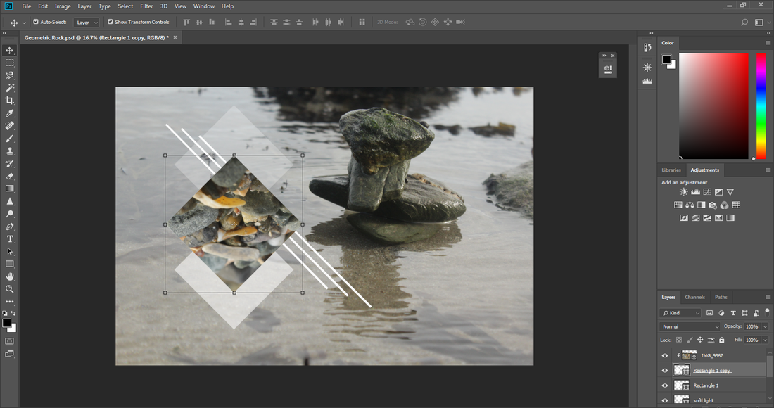
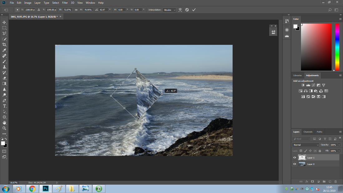
To adjust the background I pressed 'Ctrl + T' and right clicked to get a small menu.
|
I put this layer on top to make sure it wouldn't interfere withe the rest.
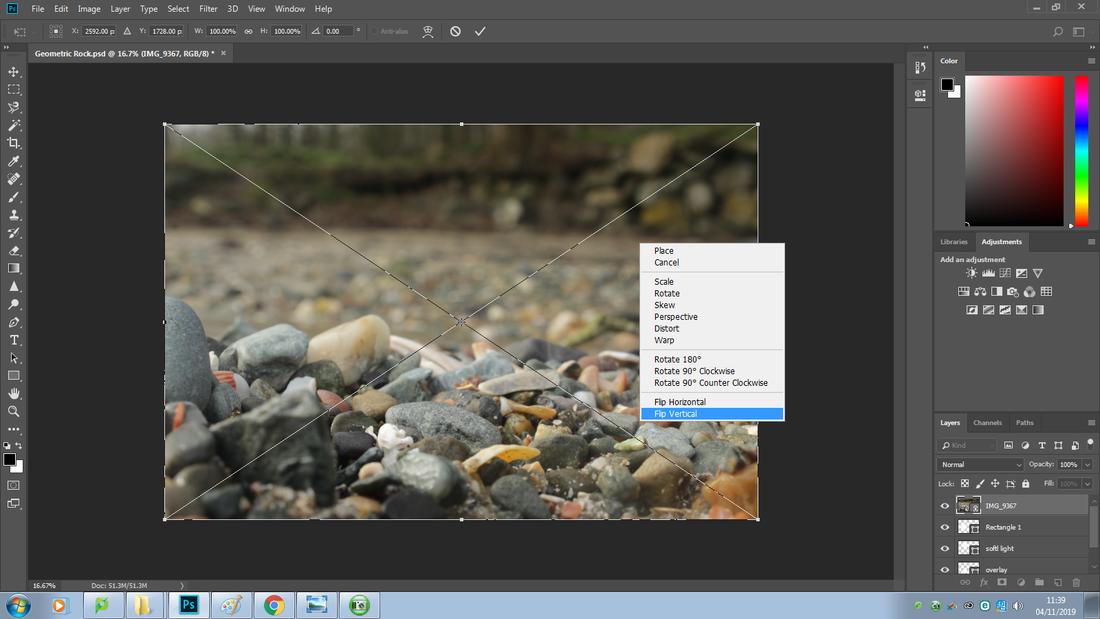
I then clicked 'flip vertical' to get the rocks at the top, because when it fits into the shape me focused rocks would appear rather then the rest.
|
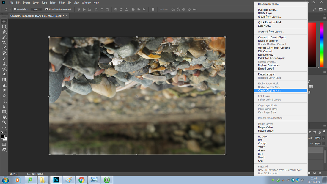
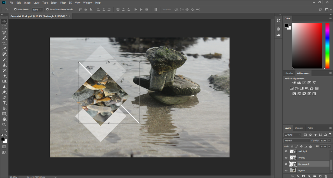
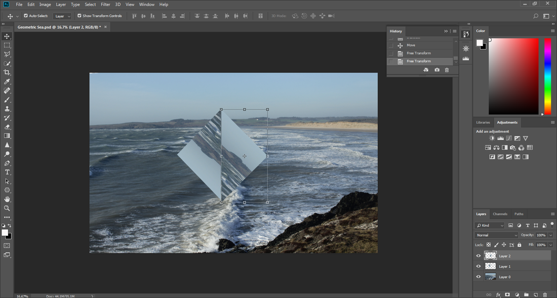
To get the image to appear in the middle main shape I made earlier I right clicked on the image and selected 'create clipping mask'.
|
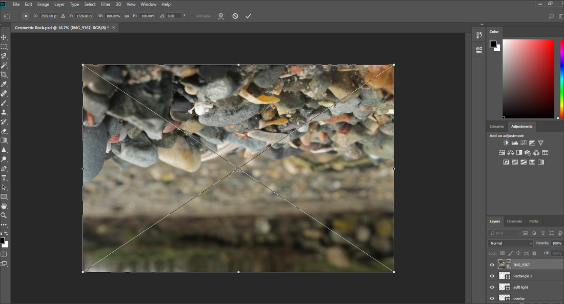
Here is the outcome from doing so, as you can see it is not fully adjusted and placed randomly, that is what I will work on next.
|
|
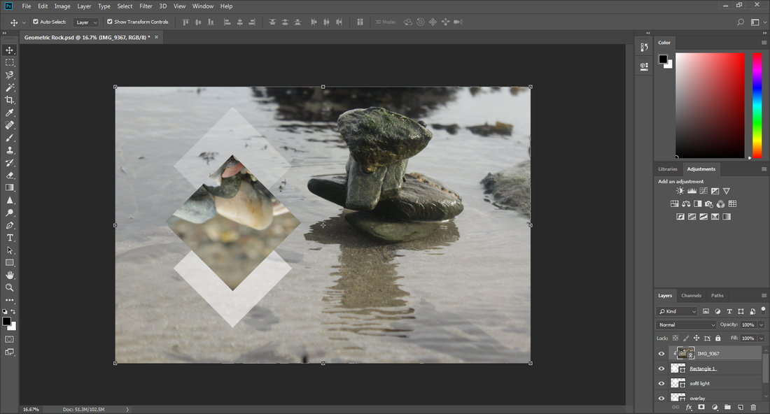
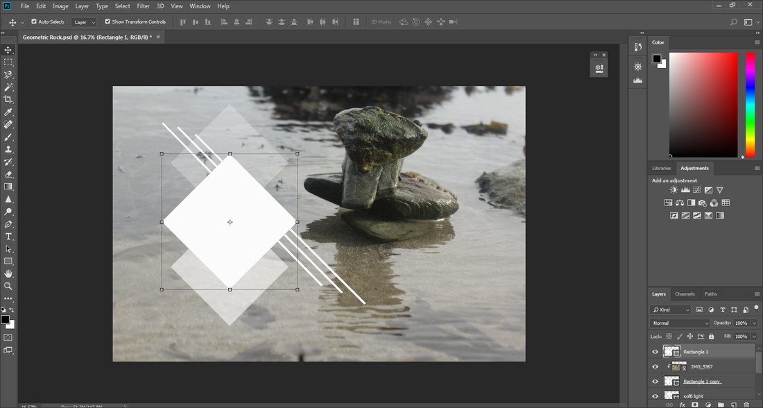
Here I used the 'move tool' to adjust the placement of the rocks.
|
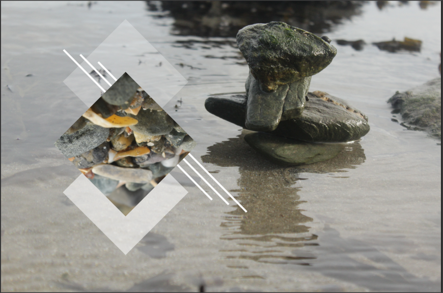
This is the placement I was happy with.
|

|

|
Outcome 1

I have finished creating an outcome for this image. Now I am moving onto another outcome using this image,
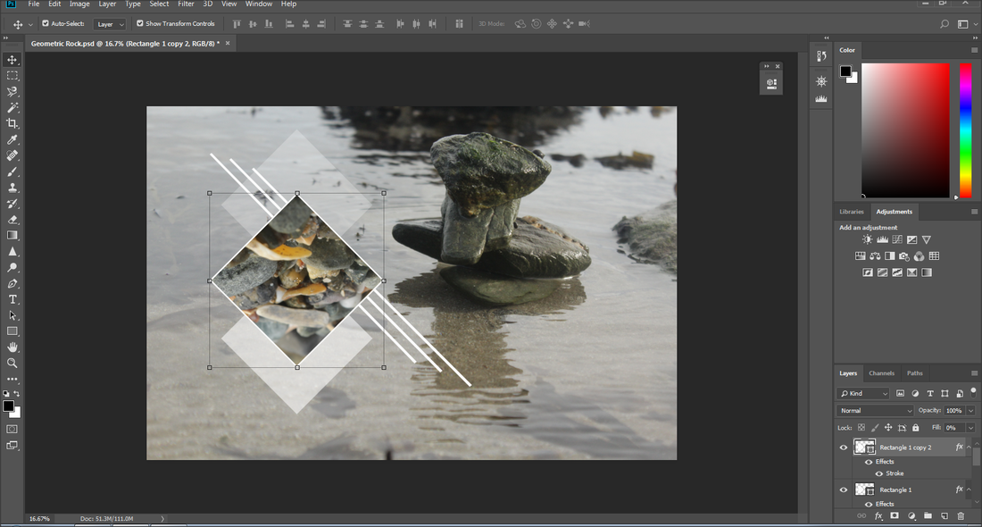
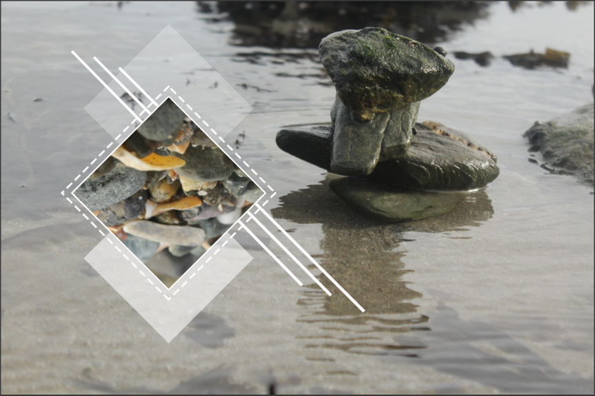
I will decorate the image with lines and bordering around the shapes I made.
I will decorate the image with lines and bordering around the shapes I made.
Attempt 2
Photoshop Process
|
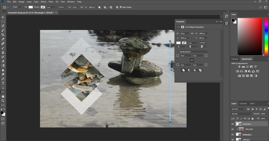
To start making the lining I went on the 'rectangle tool' and right clicked to get a menu and pressed on the 'rectangle tool'.
|
I wanted to make a very thin long rectangle, so it would appear more like lines rather than a shape.
|
|
|
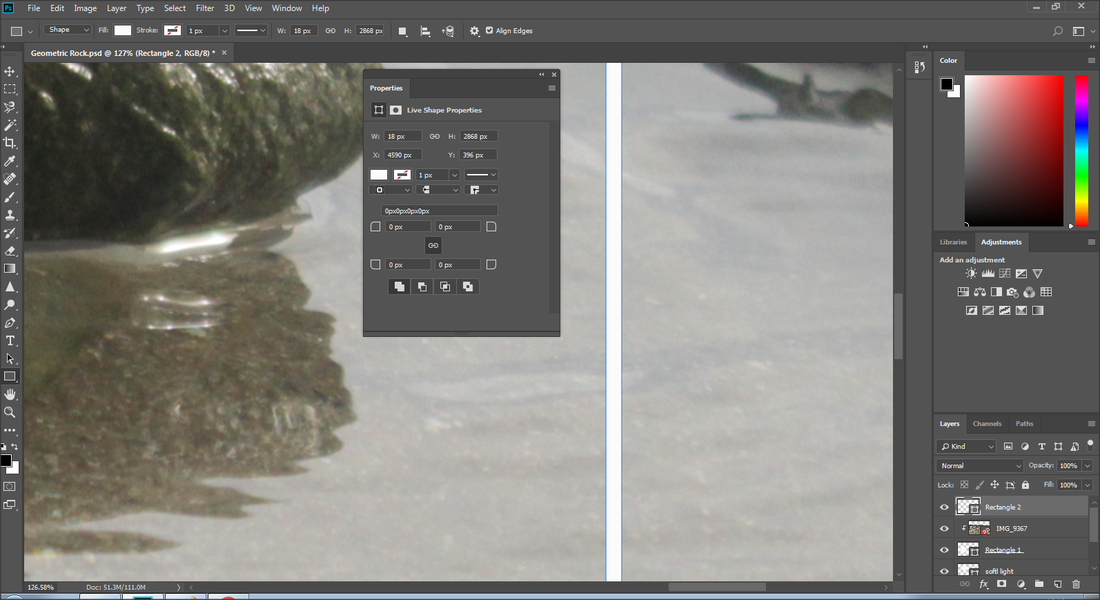
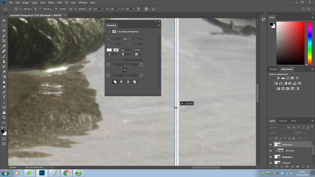
To make it even more thinner I zoomed it using the 'Ctrl and +' keys and then pressed 'Ctrl + T' to adjust the shape.
|

|
|
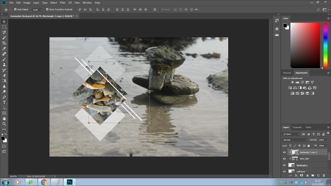
I then decided to rotate it to create an appealing look. still using 'Ctrl + T'.
I made the line correspond with diamond shape and used the move tool to move it onto the image.

I then made a copy of the line by pressing 'Ctr + J'.

|

I alligned it with shape to make sure it fitted correctly.

I then selected the 'move tool'.

|

The line that I made is called 'rectangle 2', I moved it to the bottom, just above layer 0.

This allowed me to move it, and I decided to move just slightly below the other one height wise.

|
This made the line under the shapes rather than over.
I made another copy of it using the keys 'Ctrl + J' and the 'move tool' to place it here I felt it best fit.

|
Although I liked how the linings looks under the image I was curious to see how they looked over. I moved all the rectangles to the top so it would appear over the image instead of under.

|
|

|
I liked this look to some extent, however not fully, I believe the other look was more fitting.
Moving on, to make it easier I grouped all the rectangles. Allowing me to resize all of the lines at once.
Moving on, to make it easier I grouped all the rectangles. Allowing me to resize all of the lines at once.
|
|
|
To make a border I duplicated 'rectangle 1' by pressing 'Ctrl + J'
|
I then moved 'rectangle 1' to the top to do this.
|
|
|
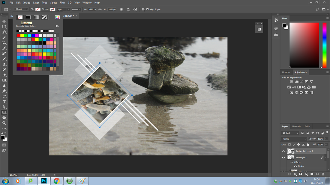
I then right clicked on 'rectangle 1' and and clicked on 'blending options'and went inyo the 'stroke' section.
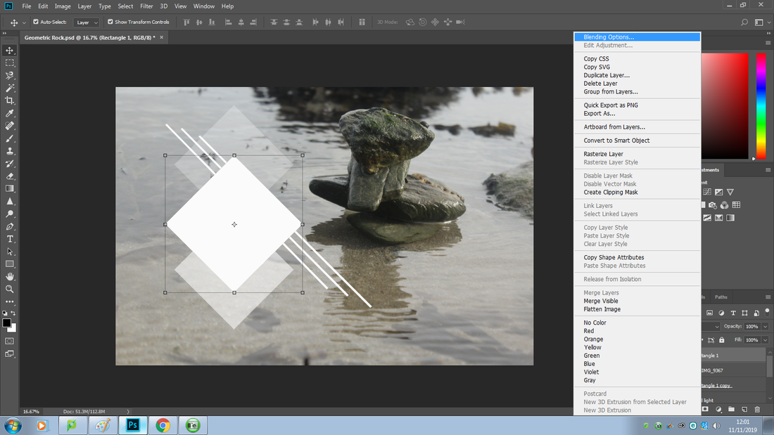
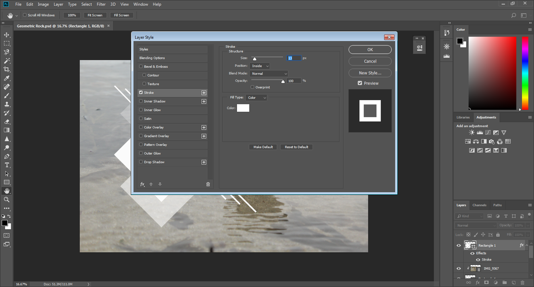
|
|
|
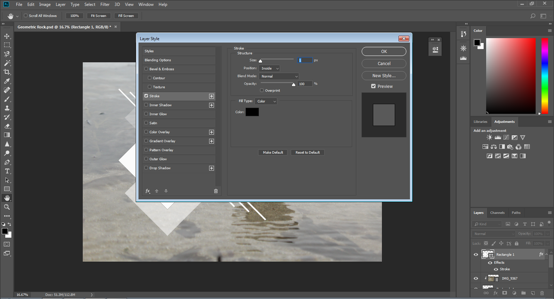
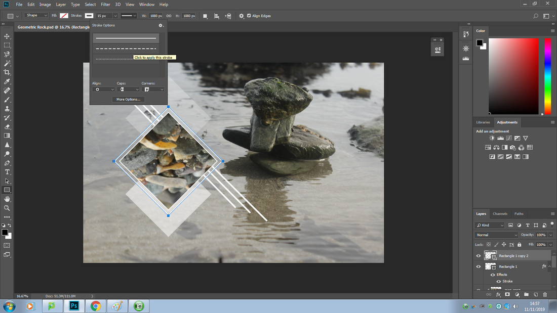
To now make the border dotted these are the steps I did.
Firstly I made a copy of 'rectangle 1' by pressing 'Ctrl+J' |
I then pressed 'Ctrl + T' to enlarge the border and pressed the 'Alt + Shift' key to keep the movement steady and precise.
|

|

|
Outcomes 2 & 3
|
|
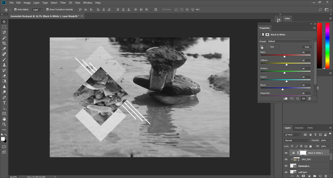
I wanted to see how it would look in black and white.

|
|

|
Outcome 4

Attempt 3
Original Image
I selected the 'rectangle marque tool' and duplicated it.
|
|
|
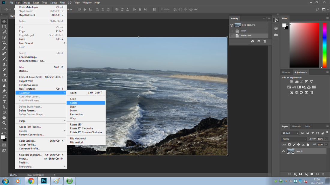
I went into the edit menu and into 'transform' and 'rotate'.
|
I rotated it upside down.
|
|
|
I then right clicked to duplicate the layer again, I did this twice to get three rectangles. I rotated each to get a pattern.


Outcome 5

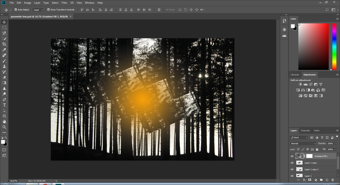
Although I liked this outcome I decided to customsie the images. By experimenting with light in this image.
|
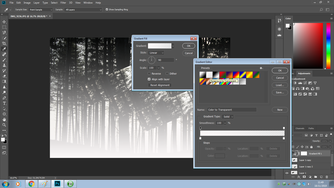
I went into the filter menu and into gradient.
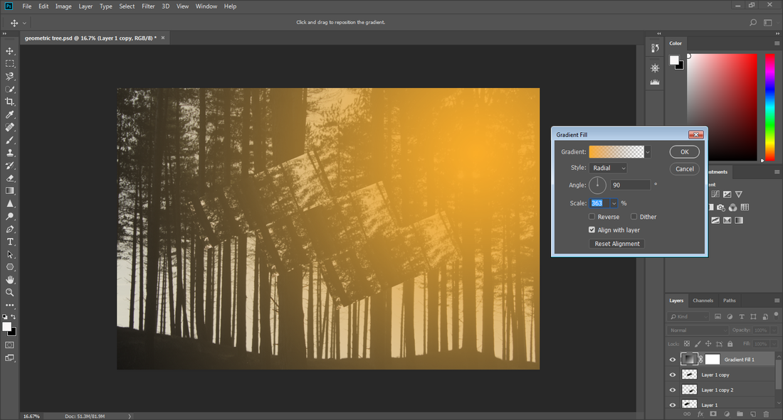
|
I clicked onto thje gradient and selected 'transparent' icon.
|
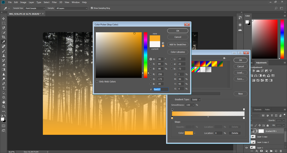
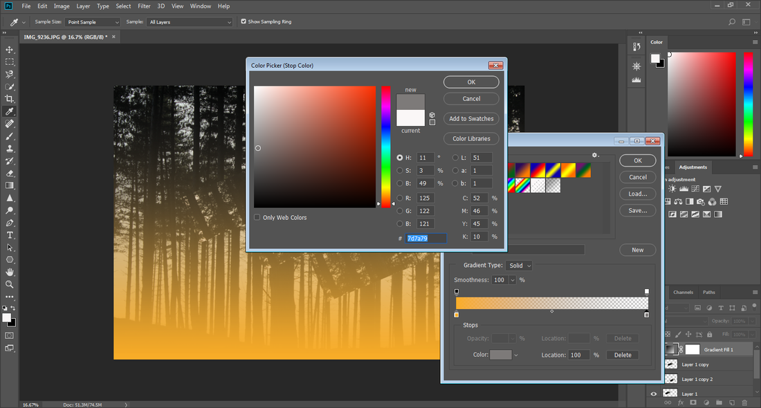
I changed the colour of the gradient to what I wanted the colour of the flare.
|
I did the same with the colour I wanted the golden-yellow to fade into.
|
|
|
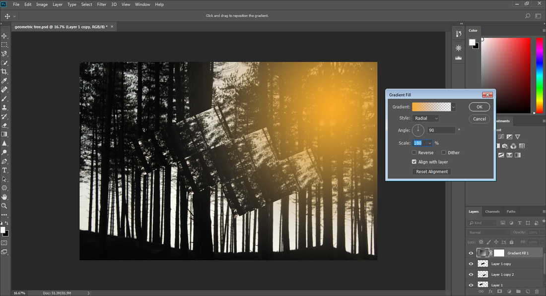
I then changed the style from 'linear' to 'radial', this made the flare be in one spot rather than all fading from the bottom.
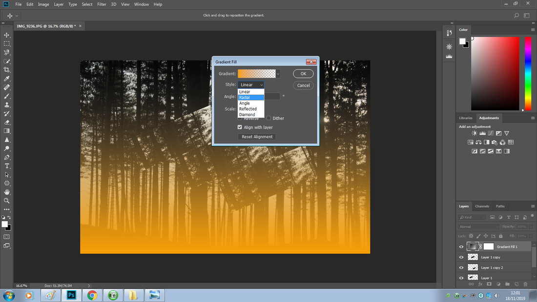
|
|
I then moved the flair to where the light source was and adjusted it to make it more realistic,
|
When increasing the scale I realised the flare was too overpowering.
|
So I decided to do the opposite and make it smaller and I preferred it this way.
|
Although I was happy with the size of the flare I realised that the flare actually darkened the image.
To fix this I changed the blend mode of the gradient to 'screen'. Changing it to screen made sure that the flare brightened the image instead of darkening it.
To fix this I changed the blend mode of the gradient to 'screen'. Changing it to screen made sure that the flare brightened the image instead of darkening it.
Before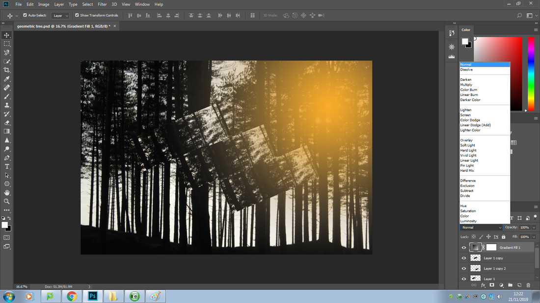
|
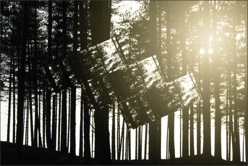
After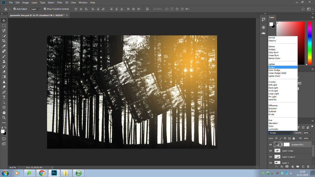
|
I liked how the flare looked but I noticed that the colour of the flare did not compliment the image and it looked odd, so I experimented it to find a colour that was fitted, in my mind I was thinking of a white to make it look naturalistic.


To add just some final touches I decided to make the images brighter by going into the 'adjustment layer' and into 'curves.


Outcome 6
Attempt 5
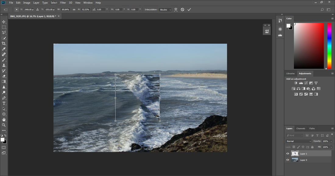
To make the image straight I firstly went into the edit menu and into transform then rotate. I rotated the image to an angle where it looked straight. I then cropped the image to the hide excess white background.
|
|
|
|
Now that I am happy with the positioning of my image I am moving onto the making of the shapes.
To make the shapes I used the'rectangular marque tool' and to make an equal square I held down onto the 'shift' key. I then copied the square and pasted it.
|
|
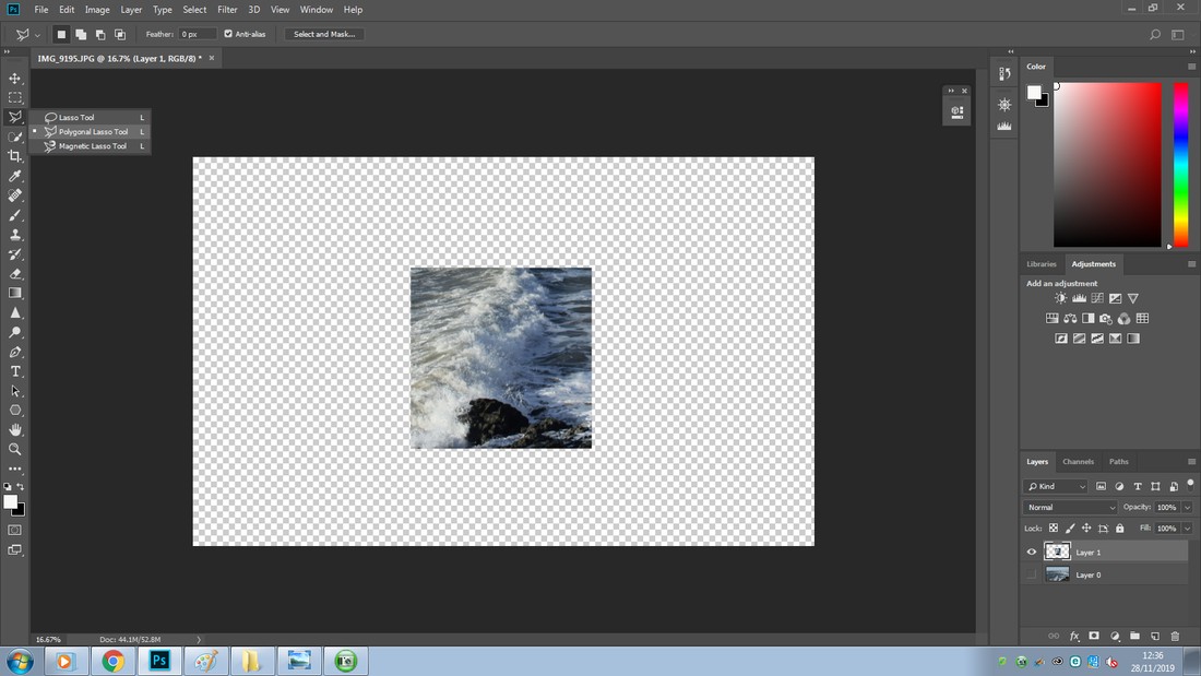
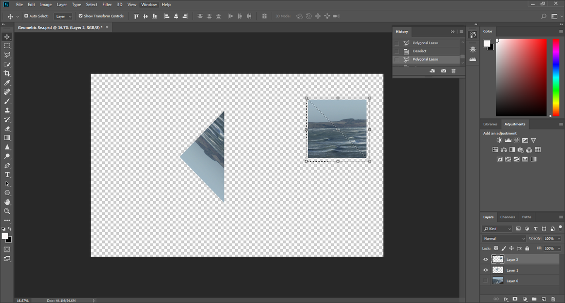
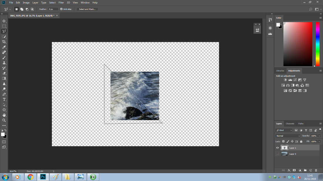
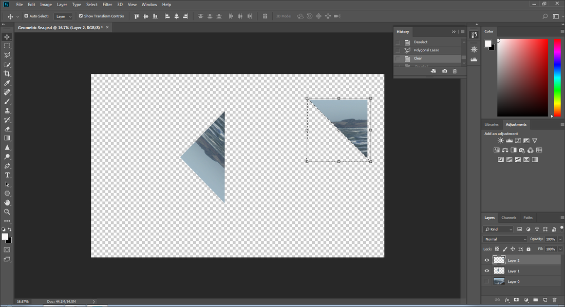
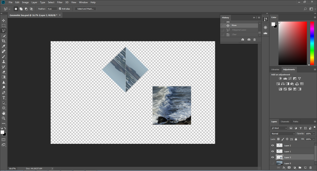
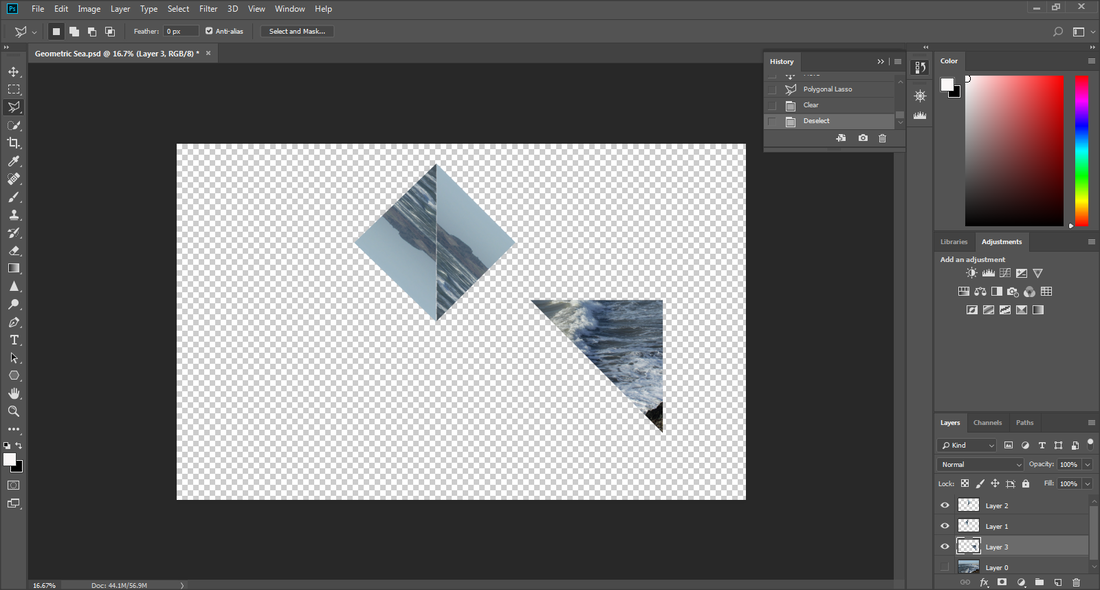
I used the 'polygonal lasso tool' to make the square in half which resulted in two equal triangles.
I did this multiple times to create shapes.
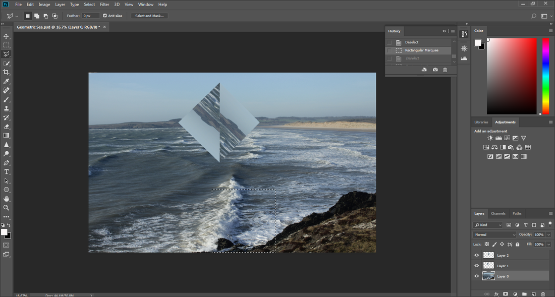
When I got the shapes I wanted I arranged them.
I did this multiple times to create shapes.
When I got the shapes I wanted I arranged them.
|
|
|
|


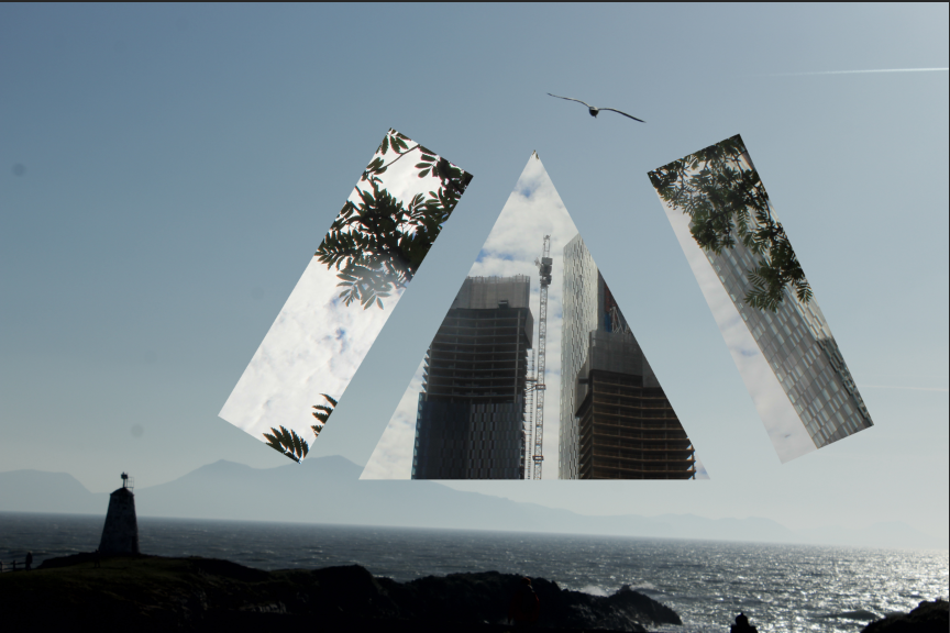
Outcome 7
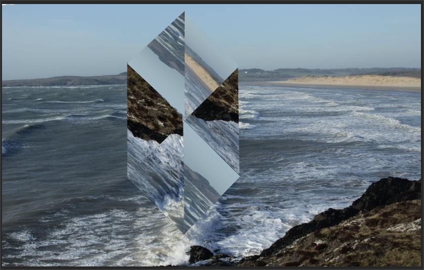


Outcome 8

Attempt 6
Here I used the software 'Adobe Illustrator' to make the shape I wanted as it was more complex. I used the 'Line Segment tool' to help make a basic shape shown in the first image. I then copied and pasted it multiple times to create the end shape by pressing the keys 'Ctrl+C' to copy and 'Ctrl+V' to paste. I also pressed the 'Flip Along Horizontal Axis' to make it flip it horizontally as I wanted to make an arrow like shape.


I copied the shape on Photoshop and separate filled each individual shape. Firstly I resized the shape using the move tool.


Outcome 9 & 10
|
|
Attempt 7 & 8
I did 2 versions of this image.
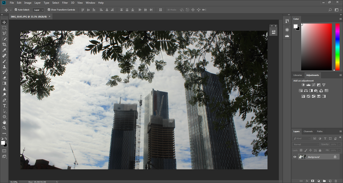
I created a rectangle using the 'rectangular marquee tool'. I transformed it using the transform and 'rotate' in the edit menu and dragged it onto my background layer.


I opened adobe illustrator to make the triangle shape using the 'shaper pen tool'.


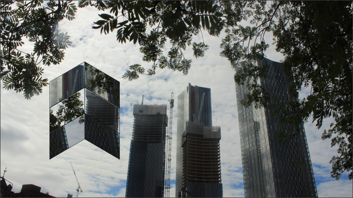
Outcome 11
I did the same for another image using a different subject image.
Attempt 9


Final Gallery
(10-15 images)


MOCK EXAM - 12.12.19
Evaluation
My theme for my project was landscapes. I was enthusiastic to proceed with the theme as the theme of landscapes is so generic and I was excited to interpret the theme in my own unique style. I enjoyed being able to travel to different locations such as Anglesey in Wales which showed me the alluring side of nature and also be able to tour the busy towns of Manchester and Salford. These trips allowed me to explore the beauty of each location as they all had such diverse views. Taking the photographs in the locations gave me much self satisfaction as I was able to capture the beauty in my photographs, achieving this can be difficult as it is all about the precision of what aperture, white balance, shutter speed, etc to use and be able to take the picture at the right moment. When taking photographs in Anglesey my aim was to capture the rural landscapes and the rarity of it, as cities are crowded and full of life, likewise I wanted to show that forests were also full of life, but in greenery and plant life. Where as in Manchester city centre I aimed to show the modernism of cities these days and specifically the impressive sky scrapers that can be seen from a far distance, but also show the panoramic views from those buildings, which I did from the top of the Hilton.
Through the entire process I have gained many skills and techniques that I previously had not had access to. The most predominant skill is Photoshop, I was weary of my skills and hadn't had much practice with it and only knew how to do very basic things like add captions or filters. During my landscape project I learned to create and add shapes on to my own image and customise the image by adding linings and dotted borders. I also learned to make layers and duplicate shapes I have made and use other tools to transform my image into looking more appealing. For example creating my own flare from scratch which all started from the use of a gradient was a great achievement of mine as it was a complicated process but I was able to commit to the task and I came out with a result I was very pleased with. I also became skilled in using tools that are on the side bar in Photoshop for example; the 'magic wand tool'and the 'polygonal lasso tool' which allowed me to cut a rectangular shape that I made with the 'rectangle marquee tool' in half to produce triangles, resulting in multiple triangles which I did to piece them together and create an overall shape. I also was able to become confident in using other software that helped me in my Photoshop journey, the main one I used was Adobe Illustrator. When I wanted to make more complicated and intricate shapes I used this software which allowed to do so, as Photoshop did not have functions or tools to do this. The use of Illustrator greatly helped in many ways as it helped me produce many outcomes and allowed me to develop my work from being basic. It further helped me solidify my computer skills overall, especially Photoshop wise, it gave me practice and if I went wrong somewhere I did not panic as I used to do previously, I would try and find a solution which gave me much confidence.
The main photographer that I researched was Legan Rooster, his work influenced my outcomes greatly as his work was the inspiration on the basis of my work. Many of my outcomes are inspired from photographs he has took and edited using Photoshop. Rooster is infamous on using the photograph he has took and creating shapes, mostly triangles, and arranging them to create a shape in it self. This has been my objective for many of my photographs as I knew that firstly it would help strengthen my Photoshop skills and give the outcomes I need to be satisfied with myself as I find his work very appealing and aimed to produce high quality images just like Rooster. As well as my massive achievement on becoming skilled in Photoshop I also learned to take images from multiple perspective. I greatly enjoyed taking photographs from a worms eye view as it required me to work from different angles and be active in considering what camera settings. Further speaking, I was able to strengthen my knowledge on the camera settings and learned the conditions that work best on each setting. This was done through our trips to Anglesey and Salford as I had to constantly work on the settings to create high quality images. At times when I had not noticed the images would come out dark and I had to adjust the white balance and ISO to fix this. Shutter speed was also a large factor on getting a high quality image as I knew if the images came out blurry or unclear I would have to change the shutter speed or adjust the focus lense, thus also allowing me to be sharp in using my camera.
The most successful part of this journey has to be my images, before and after the use of Photoshop. I believe that my my photographs even before I photo-shopped they were attractive and to a high standard. I was very proud of how my images came out as it showed me that I have learned much and been on an impressive journey with my skills, that has been shown through my work. My images after Photoshop were also great as they came out exactly how I wanted them, which were inspired by the photographer researched. I was proud that I was able to produce outcomes as high of a standard and quality as Rooster did.
